Assignment 1

Assignment 2

Assignment 3

Assignment 4

Assignment 5
Parallel Project

Parallel Project 1

Parallel Project 2

Parallel Project 3
Parallel Project 4
Support Material
Part 1

aa

a

b

c

d

e
Part 2

f

g
Part 3

h

i

j

k

l

m

n
Part 5

o

p

q
Assignment 1
Assignment 2
Assignment 3
Assignment 4
Assignment 5
Parallel Project
Parallel Project 1
Parallel Project 2
Parallel Project 3
Parallel Project 4
Support Material
Part 1
aa
a
b
c
d
e
Part 2
f
g
Part 3
h
i
j
k
l
m
n
Part 5
o
p
q
My first parallel project attempt, ( Graphite as a grisaille for indirect portraiture), was too painterly; so I decided to do another. The new parallel project is about tone and is a development from the chiaroscuro exercises in Part 2. So I cannibalised the earlier work and focussed upon male nudes as a perceived deficiency. I thought this would make the parallel project, the coursework and the earlier tutor reports more reciprocal. I hoped it would give a sense of how I’ve tried to fit it into the course and used the exercises / assignments as ways of exploring my theme.
In my tutor report 2, my first tutor pointed out an area for development in my use of chiaroscuro in relation to figurative work. She wrote;
“The chiaroscuro drawings were a good first attempt at the task and a lot where improved, I believe during the endeavour. The contorted bodies were experimental which I could presume has aided your future handling of light and dark. ‘A3 sketchbook: reductive drawing with rubber through 4B graphite and graphite powder’ is a quality study, I believe aided by the concentration upon the face or a focused portion of subject rather than the whole i.e. the body. .”
I wish to be regarded as a good student, and so I feel it is necessary to be seen to respond to tutor reports to ensure that there is a professional dialogue that is real and effectual. Additionally, since figurative work includes nudes; this would provide a neat segue to my critical review of John Currin’s work.
I propose to 1. Find a definition of chiaroscuro. 2. Research examples making links to my Critical Review focus- John Currin. 3. Graphite pencils- graphite powder 4. Charcoal with erasing and heightening. 5. Heightening with lights on grey paper stock 6. Drawing on black. 7. finally seeking greater expression and freedom.
I found Ralph Mayer’s handbook of materials and techniques to be helpful. It is the only reference to chiaroscuro in the entire volume and I quote it here in full.
“Chiaroscuro: A technique of pictorial representation wherein objects are brought out strongly by the use of black or any dark colour and white, generally in bold contrast; the entire picture is usually dark relieved by white accents. Also an element of this effect in any picture.” (Mayer, 1991, p.643)
“Chiaroscuro (modelling in light and shade) is a traditional strategy of finito, moving drawing towards plasticity, chronicity and mimesis, and as such is an extremely important aspect of academic methodology.” (Petherbridge, 2010, p.4)
I take this to mean it is a method of making an image appear complete, solid and rendered in such a way as to appear as a solid within recognisable and believable space. Mimesis I know to be an attempt to capture a realistic appearance.Plasticity I take to mean the rendering of a solid or semi solid form. That surfaces are hard or variously yielding. I am struggling with chronicity but need further research.
2. Researching examples

In this piece by John Currin, the subject of my critical review, the background being so dark throws the figures into relief. The figures, which a rendered with a smooth finish to produce unnaturally blemish free skin, appear as solid rounded forms in believable space. Currin appear to be appropriating from Botticelli and Lucas Cranach the Elder. A sense of depth is created by a greyed platform that frames the figure to the shin level and acts as a plinth. The figures enigmatically seem to be enjoying their nudity and each others company. Distortion of some kind is typical of Currin, the figures here are elongated or distended. The suggestion is the right figure is pregnant.

Venus, c.1480, by Botticelli
Both paintings are stylised images of beauty and in Venus’s case, virtue. She is modest and self conscious and untouchable; whereas Currin’s post modern interpretation is more brazen and attainable.

This painting attributed to , deals with the solemn theme of Christ’s death and displays the artist’s technical ability to handle extreme foreshortening. The theme is sacred to Catholicism specifically and Christianity generally. The background suggests a darken umber appearance.

Currin subverts the theme (based on Mantegna’s Dead Christ),and shows the absurdity of the situation facing the (imagined?) model displayed on a table. Her discomfort is humorous and is acknowledged in her smile. The darkened backdrop again acts as a foil to the skin tones and contrasts starkly with the sheets on which she is displayed. The lights absent from the candle and the lemons are a “Vanitas” standard emblem that speaks of the bitterness associated with a life ending in the darkness of death. Currin mocks this.
Chiaroscuro lighting is particularly associated with Caravaggio and Rembrandt.

ELC856914 Madonna di Loreto, 1604 – 1606 (oil on canvas) by Caravaggio, Michelangelo Merisi da (1571-1610); (add.info.: Detail. Madonna Child Jesus chiaroscuro embrace; hug face pilgrim praying man beard Creator: Merisi Michelangelo known as Caravaggio Location: Sant’Agostino Church, Rome, Lazio, Italy); Mondadori Portfolio/Electa/Antonio Quattrone; ITALIAN RIGHTS NOT AVAILABLE; Italian, out of copyright

XOS1109206 The Nightwatch, 1642 (oil on canvas) by Rembrandt Harmensz. van Rijn (1606-69); 379.5×453.5 cm; Rijksmuseum, Amsterdam, The Netherlands; (add.info.: The company of Captain Frans Banning Cocq and Lieutenant Willem van Ruytenburch;); Dutch, out of copyright

LYZ254384 Lost in Thought, 2005 (oil on panel) by Layzell, Peter (b.1962) (Contemporary Artist); 28×32 cm; Private Collection; © Portal Painters; English, in copyright PLEASE NOTE: The Bridgeman Art Library represents the copyright holder of this image and can arrange clearance.

EHT369427 Dressing the Kitten, c.1768-70 (oil on canvas) by Wright of Derby, Joseph (1734-97); 90.8×72.4 cm; Kenwood House, London, UK; © English Heritage Photo Library; PERMISSION REQUIRED FOR NON EDITORIAL USAGE; English, out of copyright PLEASE NOTE: Bridgeman Images works with the owner of this image to clear permission. If you wish to reproduce this image, please inform us so we can clear permission for you.

FLE102272 Wireless Vision Accomplished, 1987 (oil on canvas) by Conroy, Stephen (b.1964); 137.1×121.9 cm; © The Fleming-Wyfold Art Foundation; PERMISSION REQUIRED FOR NON EDITORIAL USAGE; Scottish, in copyright PLEASE NOTE: This image is protected by artist’s copyright which needs to be cleared by you. If you require assistance in clearing permission we will be pleased to help you. In addition, we work with the owner of the image to clear permission. If you wish to reproduce this image, please inform us so we can clear permission for you.
3. Graphite pencils
I began by rendering male nudes in graphite on a plain background to see if I could make a believable figure that had the illusion of solidity.

A3 sketchbook
I attempted a seated male nude using Faber Castell 9000 series graphite pencils on Daler Rowney A3 sketchbook. I worked from 4H, 2H, HB to 2B following a method called the five pencil technique. I am quite satisfied that the form is modelled with a range of tones lit high left, about 11 o’clock to the viewer. I learned that there are different grades of pencil that are equivalent to various skin tones and shadows.I normally don’t normally begin with 4H. Beginning this way is very time consuming.If I was to do it again I would document all the stages of the tones building up. I feel I have achieved a reasonable form with some graduation of tone that indicates a light source. This figure has helped develop the skill of shading with a graduation of tone. This experience has encouraged me to practice the shading skill but to explore shading in that reduces the scratches of cross hatching with 4H and 2H pencils I feel eager to attempt another male in the same manner but on a thicker grade of paper. The sketchbook is 90gms.

Faber Castell 9000 4H followed by 2H on A3 Canson bristol board. Hair begun in HB.

A3 Canson bristol board

A3 bristol board
This time I used my Faber Castell 9000 pencils on the ultra smooth surface of Canson Bristol board.I worked large again because I knew I had fingers and toes to render realistically. The light source was high right and a secondary light source offering softer light from the viewer’s right.I am delighted with the detailing of the texture in the hair. The toes and the soles of the models right foot were paintakingly rendered. The inclusion of 4B has added depth to the shadows under the neck. The muscle groups are evident but the inside of the model’s thigh is to abrupt and flat. I learned to soften my handling of the harder graphites. I was more subtle but also more firm to build my darks. This took bravery. If I were to do it again I would follow the same procedure but try blending my graphite to reduce the matrix of strokes and soften the cross hatching.I should begin with my lightest as normal but to blend with a tortillon or a torchon before moving to the next pencil.I believe the bristol board will withstand the “rough” treatment.I feel I achieved a believable form with a wider tonal range that suggests light and shade. The extra practice, it is very time consuming, has helped me predict outcomes of the method better and I am developing confidence. I plan to make another seated nude but aim for more rounded muscle grops. Look for hard edges near bone, softer edges for flesh. I can use this to eplore the plasticity of the modelled form. I feel less anxious about attempting another with a top lit light source.
Rendering a form

4H

2H

HB

2B
My model is fair haired and boney. I followed the five pencil procedure as far as 2B. I really worked the darks by pressing very firmly but the bristol board with stood the intensive over working. I am pleased that the limbs are cylindrical addressing the previous problem. The washed out skin tones permitted some lost lines; evident in the earlier piece, but more so here especially at the hip. I am disatisfied with the tonal balance of the eyes that appear too abruptly dark.I learned to titlt my pencil and apply graphite at an oblique angle to the page.This gave a more diffuse application of graphite without distressing the substrate. The tortillon and torchon works to graduate the transitions over the softer muscle. Bones are harder and the transition from light to dark is more abrupt and forms an edge.I have learned that chiaroscuro means light dark. That if you read a section of the drawing from left to right it t alternates light dark, light dark to give the illusion of solidity to the form. Next time. I would like to explore the darkened background to throw the figure into relief a la Cranach or Botticelli. This will bring me closer to my Critical review subject; John Currin, and provide a neat segue between my exercises, critical review and parallel project. Next time, I would like to work more loosely using the same method but adding a blackened back drop.I feel I have achieved the illusion of 3D on a 2D surface. I am becoming more fluent in my rendering of graduated shading- and even speeding up. But the works are a little stiff and lack spontaneity and expression. They do demonstrate some technique- but lack emotional content. In tutor report 5 my tutor stated, “The drawings you have sent me that belong in the parallel project are all competent and slick. They are a little dry when compared to the energy you display elsewhere, though”.
I could have continued making these drawings and try to become more refined and academic in approach. I was, however, beginning to suspect they lacked energy and freshness. This work is helping me practice the skill of rendering light and dark to give forms the illusion of solidity but not space. I think I should explore how a blackened back drop throws the figure into greater relief. This will allow me to explore achieving rich dark tones and seek a broader range and greater contrast. I have used some reductive work using an eraser to tidy up but not to seek greatest contrast of Rembrandt or Caravaggio lighting.I believe my next steps should be to rework the subject in a looser style but to seek greater contrasts. I feel anxious that so much rendering on a large size, for instance A3, could be really tiring for me with my chronic fatigue. To manage, I think working smaller would lessen the work load.
So, responding to John Currin’s appropriation of Botticelli, I decided to experiment with a darkened back drop for greater relief and contrast.

A5 Sketchbook

A4 loose leaf

A3 Sketchbook
I made three drawings of the same subject in my A5, A4 and A3 sketchbooks attempting a stage lighting effect in the style of Caravaggio. I scaled up using griding. The A5 sketchbook was worked with my usual five pencils and blending with a tortillon. The paper is on 90gms and so wear and tear is evident. I repeated the subject on Winsor and Newton bristol board. This permitted greater darks but the tonal balance does not work well. The figure, strongly lit from the viewers high right, appears washed out. The figure was completely enclosed in the blackened backdrop. The A3 figure had partial backdrop and I allowed the details to disolve and only be suggested. I learned that it is not necessary to indicate every detail and just to suggest forms. The viewer’s imagination can supply the want of information.My next steps would be to try a fully rendered form with a dark background and a greyed plinth to suggest depth.I have been using Faber Castell but I would like to explore Staedtler Mars Lumograph or Derwent graphics to see how they compare. I feel I have achieved some expression and energy in these last pieces but at the expense of detail. I now realise that I may use selective detailing to guide the viewer. Realising this means that in future I may select which portions are important. I feel that the more I draw the more likely I will improve skill and discernment.

A4 sketchbook

A4 sketchbook
I drew two more A4 drawings in my sketchbook of seated male nudes using earler poses that interested me.In the first I rendered the body more fully in Derwent F grade pencil. I felt the page “accepted” the graphite more readily than Faber Castell. The second piece was completed using my preferred five pencils but 4H and 2H were Mars Lumograph. The background were both completed in 4B. I had mixed results.The first lacked contrast between the figure and the back drop and appears quite grubby.I was thinking of blocks of tone rather than rendering a drawn figure. The second piece displays greater definition and stronger contrast. The skin is shaded in a “tighter” manner and looks more refined. Both have detailing in the fingers and toes that is quite intricate. Blending with a torchon occurred in both pieces and I determined to merge the figures with the backdrop so that the figures emerge into the light.Highlights were lifted out with a vinyl eraser in the top figure and a rubber pencil in the second. Not merely to tidy up contours but the draw the light.I learned that the pencil eraser permits detailed erasing in a controlled way. The vinyl rubber was more blunt. Ruminating on the problem I stumbled upon the idea that the vinyl eraser can be cut to provide facets with various effect applications.I am disappointed with the scatchiness of the background. I seek a matte flat appearance and the texture spoils this. Even with blending the effect is not eradicated. Perhaps if I used very soft pencils or graphite powder. Next time I could eliminate 4H and 2H that score the surface if applied with a heavy hand. Or perhaps I could sharpen my pencils to afford a broader tip. I have achieve a sense of depth with the addition of a greyed plinth and the softening of the contour lines by blending to have vanishing lines. I am not sure I am putting any theory into practice. I believe the approach I’m adopting is academic and academic drawing was predicated on notions of beauty and truth that no longer apply in the post modern world. It is an 19th Century aesthetic Perhaps if I allow a more expressive approach I may tend towards expressionism of even abstraction.The second piece is a lovely fusion of accuracy and looseness especially in the hair. I can use this understanding to explore portraiture in the future of other media to pursue the matte black I am interested in.I feel a skill is only learned when it can be applied to different genre such as protraiture or when the technique is explored using different media.
I was disappointed with the finish of the dark rendering in graphite. There was a textural quality, a scratchiness that spoilt the flattened effect to contrast with the plasticity of the figure. At this point a segue between my current and former parallel projects appeared and I appropriated material from a self portrait initially intended as a grisaille for more painterly development I deemed inappropriate for a drawing course.
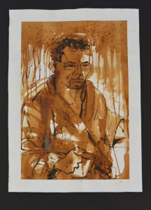
Self-portrait
On the 7th and 8th of August I collaborated with the public at Belladrum Tartan Heart festival and incorporated a drawing strategy that might function as a grisaille. I saw that as a multi-dividend.
I have been lucky to have been asked to be UHI’s unofficial “Science Artist in Residence” for four projects. Three at Belladrum and another within Primary schools on the Black Isle. This years theme was super heroes. I felt that the “creatives” that make comic super heroes are heroes themselves. Stan Lee features prominently in Marvel comics and spin offs.
I decided the title for my project should be ” You and Me Versus Stan Lee”. And a portrait of Stan Lee and Myself were needed. Since the purpose of the work was envangelical, in spreading the word about the joy of being creative through art; I felt I had to do some preparation so that I could concentrate on encouraging public participation and try to forget I have an artistic ego.

Graphite portraits
I used a technique commonly seen on the internet call the 5 pencil technique working from 4H, then 2H, HB, 2B and 4B in that order. I modified this a little by mapping out the facial features in a darker pencil and then follow the sequence faithfully. Because it is a procedure it is reassuring that following the steps will almost guarantee a reasonable result or likeness.

4H stage
I have prejudices about pencils and paper. In my OCA studies I am reading “Writing on Drawing ” by S. Garner and I recognised myself in a chapter titled “Pride, Prejudice and the Pencil by James Faure Walker.I favour Faber Castell 9000 series graphite pencils on Canson Bristol Board. I was working large and selected an A3 pad. I printed out photos to 4 x 6 inches and used a Kopykake projector to position the main features. At this stage I have picked my darkest areas and with a 4H and toned the faces to map out the facial planes.

2H stage
I never use my finger to blend but prefer to use a paper stump called a torchon or sometimes a tortillon. Once I have smoothed out all the scratches, I revisit the same areas with the next pencil up (2H) and then go back to the previous pencil (4H) and bring the surrounding lighter tones compared with the earlier work. I follow this procedure moving forward and bringing up the rear until I reach the desired value and then I discontinue using that pencil. Again blending smooth the tones for the skin an makes for gentle transitions. There are other ways to draw, this is only one, and blending is not always welcome.

Self-portrait at HB stage
When I reached the HB stage, I focussed on getting my portrait near finished to the point of eraser work for highlights. Our skin is oily, that’s why I never blend with a finger as I do not wish to introduce oils into the substrate; and reflects light quite distinctly from camera flashes. I decided that I would reserve my grey hair by drawing with an embossing tool. This makes trenches or trought engraved into the Bristol Bord paper. By shading with the side of the pencil at an oblique angle, I can darken the tone at the temples but protect and reserve the white in the embossed trench. The same technique was used for eyebrows and on Stan Lee’s moustache.I made an early attempt with a putty rubber to make irises around my pupils.

Self Portrait with 2B and 4B
Now reaching the 2B and 4B stage, I recognise that the skin tones are approaching the correct value. Tonal variation in the hair and restating feature contours was consolidated. More blending means wear and tear on the surface but the Bristol Board can withstand successive reworking.

Stan Lee
I returned to Stan Lee at this point and tried to bring his portrait to the same 4B stage. I experimented with 5B for the glasses.

Me versus Stan Lee eraser work
Some tweaking with the pencils continued until I was satisfied and eraser work could commence in earnest. Blu Tak makes a putty rubber substitute, pencil rubbers exist. A pencil with a rubber core and these are ideal for contouring. They can be sharpened in the usual way or with a craft knife. A craft knife means vinyl rubber can be cut to specific tasks and electric erasers, being most abrasive, can be selected for the harshest highlights. I sometimes make these sparkle with the late addition of white acrylic ink. I believe Louise Bourgoise did this in her drawings ( according to Petherbridge in her book “The Primacy of Drawing p.121” but I opted not to.
At this point I still believed I was going to use the drawing as a grisaille under painting for acrylic glazes. This would not be the case. Also, I believed that I would open the skulls and leave a lid like a pedal bin mid-action but abandoned this idea subsequently.
Finally, I decided to photocopy my originals and play around with the toner setting for darkness and contrast. The works development and subsequent blog was featured in Weareoca.
http://weareoca.com/fine_art/you-and-me-versus-stan-lee/
Graphite Powder
I found building up the portrait images with graphite pencil very time consuming. I have ME and I tire easily, so I speculated that if I could tone the page with graphite powder, this would be speedy and eliminate the distressing caused by 4H and 2H pencils scoring the surface.

Using new media-graphite powder

Powder applied
The powder is messy and applied unevely in this first attempt. I dipped my brush and initially applied with a dabbing motion to lay down a film. Smoother strokes were used to distributes the powder and to tidy up the excess residue that was returned to the pot.

Smoothed with tissue
Finally I smoothed the tone with successive passes with a paper towel. I attempted even coverage with circular motions and long sweeps. The result was fairly smooth yet subtly textured substrate with a effective mid tone approximating HB. From this I intended to develop darks and introduce highlight either by reductive rubber work or white pencil I sealed this layer with workeable fixative called Perfix. I resolved that I should attempt reworkings of the ealier motifs.

A3 cartridge with graphite toning
I toned proprietery cartridge paper with Creatacolor graphite powder to create a mid tone. Then, I used a Koh-I-Noor mechanical pencil loaded with 8mm 6B lead to add the darkest values and throw the positive shape into relief. Finally, I added lights be erasing with a Derwent rubber pencil sharpened to a point in a Jakar electric sharpener. I really don’t like the result. The form is flattened like an Alex Katz painting. The fingers lack detail and the muscle groups are lost. The tonal contrast is dulled and the highlights lack punch. I learned that the graphite powder has a dulling effect and that my eraser was not pulling its weight failing to clean the surface adequately. Next time I would strengthen the lights by including white coloured pencil, or pastel pencil after reductive work. I believe I would like to tone the page over an accurately contoured figure.I have achieved tonal fields that present a flattened pattern of the male form. I am disappointed because I am applying the criteria of realism. This is a step towards abstraction or decorative figurative work. I am interested in abstraction but do not feel ready for it. I am unsure how this makes me better at a skill. It speeded up my otherwise time consuming approached. It has forced me to loosen up and relinquish some control. This may encourage more expressive mark making; but, I feel I should reserve judgement. In future, I will attempt another male nude but this time heighten with white coloured pencil. I can use this study to contemplate figurative abstraction. I feel abstraction would be the culmination of my studies as I leave realism behind- but I am reluctant to do so.
Next steps
I am satisfied that there appears to be a male form lit hight from the viewer’s left. The graphite powder had a levelling effect. I attempted a chiaroscuro blackened backdrop using a Koh-I-Noor mechanical pencil with an 8mm diameter 6B lead. This meant good coverage was applied fairly rapidly compared with the hours of work following the earlier method. The masking tape reserved a good clean frame that I like. I attempted adding lights with a rubber pencil. It worked to an extent but the tonal contrast was limited. The drawing is much more loose and expressive. The result lacks definition. Were I to attempt this again, I should try a vinyl eraser and heighten with white coloured pencil or pastel.
Graphite powder 2- heightened with while coloured pencil

Graphite powder over contoured outlines
I began by drawing the contour hollow form of my figure using a Derwent F grade pencil I find versatile. I used graphite powder applied with a nylon fan brush to applied a mid tone. When I began my drawing disappeared. Since I wished to have more detail than my first graphite powder attempt, I darkened the contours and continued with the powder.

6B Back drop
Next, I used my 6B lead in my Koh-i-noor mechanical pencils to darkened the backdrop by shading the negative space. This made the figure “pop”

4B graphite with blending and erasering
I worked rapidly using a 4B Staedtler Mars Lumograph. Having the backdrop early in the process gave me confidence to do so knowing the figure was fixed by the negative space. The graphite is very soft and granular for a 4B especially on this surface. I blended the body contour with the back drop using a tortillon. I wanted to keep the mark-making loose.
I am satisfied that the strategy of dusting over a drawing still retained the detail lacking from the earlier attempt.Unfortunately, it lacks a stark contrast and is grubby. Although light and dark exists the form is again flatter than desirable. I learned that filling the negative space gave me confidence to work within the positive space with greater freedom. Dusting with graphite powder reveals oily thumb prints but thankfully was disguised by the backdrop.The method is analogous to working light to dark- like watercolour. I think the next attempt I should darken the backdrop before dusting working dark to light- like oil. I think I should aim for a better balance between a believably rendered form and expressive mark making.Also, I believe I should aim for greater darks that will make the lights brighter in comparison rather than finding the light by erasing. I think I have achieve some spontaneity but should consider committing more fully. This drawing has improved my skill at laying a fast wash of mid tone and erasing with greater clarity. From this point I plan to work without using hard grade pencils but a 4B and find a range of tones by controlling intensity and pressure.. If feel optimistic that the form will be realistic and yet retain the quality of being a drawing.
Graphite powder 3- heightened with white pastel pencil

Graphite powder over contours after blackened backdrop
For this third graphite powder attempt, I began with the contoured outline of my figure. But, before I applied any graphite powder, I blackened the negative space. This gave me a distinct positive space to spread the graphite powder. I made sure I made a strong outline as I learned the powder dull the line making it difficult to read.

Graphite powder application

I am delighted with the finished result. There is good tonal modulation across the limbs and a light source is clearly indicated. Unfortunately, to make a distinction between shadows on the legs and the backdrop, I had to leave a line. Similarly with the model pecks. A thin light line is left and is proving distracting. I learned how to control the pressure on my 4B pencil to gain a wide range of tones. I would with softer pencil that did not abraid the surface so much- a problem in my earlier sketches. Next time I would like to use charcoal pencils to extend my repertoire and skill with the media. It has always been a weakness.I think I will work A3 or even bigger because I believe larger drawings promote expressiion. Using a range of charcoals with erasing is not too much of a technical or conceptual leap. I feel I have managed to use my graphite powder, reduce grubbiness and find greater contrast by erasing and heightening.This piece has helped me speed up my drawing practice and achieve dark tones without distressing the substrate with overworking. This suggests to me that I should attempt to create a darkened backdrop with dry media without scratchiness and texture.Wet media would be easy. I require a flat matte finish. I feel confident that this can be achieved with coloured pencils.
Next steps
Despite my best efforts, the darkened backgrounds retained a scratchiness because of the accumulation of cross hatching. No amount of tortillon or torchon blending could remedy this. I was disappointed because my preferred aesthetic was to produce a matte black.
Two ideas presented themselves. 1. Darken with coloured pencil. 2. Use charcoal
Darkening with coloured pencil

A3 bristol board with coloured pencil background


A4 graphite on A3 Canson Bristol board

A4 graphite on A3 Canson bristol board
I drew two more nude figures on Canson Bristol board (my favourite) and working with 4H,2H, HB, 2B and 4B to render the form. I am now favouring Sraedtler Mars Lumograph for the hard pencils and Faber Castell 9000 for the softer grades.Finally, I darkened the backdrop with Faber Castell polychromos black. I am really happy with the graduation of graphite transitions. The muscle groups, the thing that attracted me to these subject, are defined and convincing. The detailing on the first is less convincing and absent in the second due to close cropping. I learned that the polychromos pencil does give a flattened field of colour and limited the textural elements I disliked earlier. Reading up on the product, I am aware that these pencils may be blended with turps to remove strokes further. I also experimented with using an embossing tool to indicate veins on the second figures arms and chest. The result is subtle but evident if you look for them. I am becoming disconcerted with the sheen that appears on heavily rendered graphite. I f I were to attempt further work I would be inclined to use charcoal that does not have this disadvantage or try laying down a bed of graphite powder to see if that reduces reflections.I feel I have made well modelled forms on a matte black backdrop emulating the Botticelli and Currin examples.I am not sure what drawing theory I am demonstrating. I am becoming aware of mimesis and verisimilitude as an ideal of 19th Century academic drawing. I seek something more than copying reality. These recent drawings have helped me get closer to the strongest contrast I have been seeking. The figures are thrown very much into relief and I am satisfied I have appropriated the chiaroscuro look. This learning allows me to explore partial chiaroscuro effects ( see Durer below) or even dramatic lighting effects of uplighting such as Joseph Wright of Derby.

Plasticity
Albrecht Durer “Nude Self-portrait, (1503)
Additionally, this has made me consider wet media such as ink or gouache but I am steering away from painted techniques. I think partial drawing and chiaroscuro could lead to more contemporary figurative drawing.
4. Charcoal with erasing.
This is a different medium but the effect of the dichotomy of opposites is in evidence and so is a continuation of the charcoal work. Strong darks as a foil to heightened lights. I admire Durer’s frank assessment of his own body. It is fearless and uncompromising. The arm also disintegrates to nothingness. The lengthened legs are mannerist in appearance. The image is complete in its incompleteness.

Rigaud
Hyacinthe Rigaud (n.d.) “Portraitof a Man”
The heightening technique adds a satin sheen to the subjects jacket and adds depth and believability. The lower portion of the painting has greater opaque substance. Again there is a faded incompleteness and I wonder if this is the subconscious unifying element. I am reading semiology at the moment and art as a system of sign and symbols is on my mind. Barthes and Baudrillard’s writing are making me question the nature of meaning-making and how it relates to language that includes pictures.

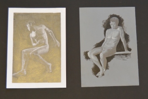
Pierre-Paul Prud’hon ( 1785-90) “Standing Female Nude,Seen from Behind”
I included this as as an example of classical atelier and as an example of classical academic approach perhaps as a counter- argument to Creffield and Bomberg. Technically accomplished it is the antithesis of expressivity and a model of mimesis and the desire to pursue verisimilitude in copying truth and beauty- or one version of it. The stage lighting is impeccable, and the tones model the plasticity of the form. Certain flesh is soft and yielding. Muscles are firm and bone is hard.
I looked on youtube to find guidance on using charcoal pencils.
charcoal figures

Back drop using dark charcoal pencil
I bought myself Derwent charcoal pencils. They come in light, medium and dark grades. Because I am unfamiliar with them, I worked the black backdrop first to get a feel for them and I blended with a tortillon.
I masked out a plinth and shaded up to this “horizon” hoping that I could build up the tones within the positive space. How well (or badly?) did it go? I was really happy with the depth of dark achieved and the fact it is matte in appearance and not reflective.

A3 charcoal pencil
That had been a problem with the graphite. Charcoal doesn’t spread very far with the tortillion. Next time I think I should tone the page using vine charcoal, darken the back drop and then work the tones. I feel I have blended the personality out of the mark making. I feel, as I am nearing the end of my investigations I should leave traditional academic approaches behind and look for something more contemporary. Perhaps more expressive scribbles on top of blended limbs. I have achieved some nice tonal passages especially the models right shoulder and extended left leg. By experimenting with this media I am extending my skills. The tortillon was used more to apply new charcoal. Previously I merely blended applied graphite and perhaps spread it further or fudge boundaries. The onus was on keeping the areas clean and so I used a sheet of greaseproof paper to rest my drawing hand on. I learned that fixative dulled the image. For piece I used Silvikrin hairspray. This experience makes me wish to try again with my male figures.I have not experimented with papers so far. I think it would be valuable to use larger papers and perhaps purchase charcoal specific paper such as Strathmore 500. However, the immediate next steps just involves more practise. I feel quite positive about this because the charcoal covers surfaces more rapidly and darkly too without distressing the substrate surface.
That said, I would just be retracing the steps I took in graphite.
Picture credits
Taylor, Anita. (2004) “Resigned” [charcoal on paper] Drawing Projects;: an investigation into the language of drawing. Black Dog: London p.
Durer, Albrecht (c.1503) ” Nude Self Portrait” [ pen and brush, heightened with white on green grounded paper] Primacy of Drawing: Histories and Theories of Practice. New Haven: Yale University Press, p.341
Rigaud, Hyacinthe. (n.d.) “Portrait of a Man” [black chalk, grey wash, heightened with white and grey gouache on blue/grey paper] Primacy of Drawing: Histories and Theories of Practice. New Haven: Yale University Press, p.89
Pierre-Paul Prud’hon ( 1785-90) “Standing Female Nude,Seen from Behind” [ charcoal heightened with white chalk on blue paper] Primacy of Drawing: Histories and Theories of Practice. New Haven: Yale University Press, p.59
________________________________________________________________________________________________
Research Point page 32
Angela Eames
5. Heightening with lights on coloured paper

My Critical Review featured artist John Currin provides a good example of heightening on coloured paper. In the image above, Currin is mocking the upper class. The paper provides the mid tone and so to model the form only darks and lights need be added with blending for transitions.

Graphite on tinted paper
I returned to an earlier drawing that I was dissatisfied with. This time I worked on mid grey paper and this negated the need to tone my substrate with either graphite or charcoal. I added my darks with a Staedtler 4B and blended transitions with a tortillon or paper stump. Some lights were added with a Faber Castell Polychromos white ( 101 ). Finally I “shrouded” the figure with black acrylic ink applied with a round head brush. I found this a very speedy method of modelling a form realistically.This is a problem as I intend to move away from mimesis and verisimilitude towards something, I do not know what, more expressive or abstract. I learned that white pencil sinks into the grey surface I am drawing on. I may need to top this up and in reality I adjusted the exposure of the photo to match my original before dulling occurred. Next time I feel I should attempt the drawing in charcoal pencil and intensify the light passages for bright more harsh lighting effect akin to the Durer example in this blog. With dulling,I achieved a soft lit form. This attempt speeded up the modelling of the form and created light and dark passages to create the illusion of 3D on a 2D surface. I plan to find abstraction by changing the lighting of the form and perhaps zooming in to turn the body from a recognisable being to a more abstracted landscape.A body scape. I think this realisation will be the culmination of my parallel project. I feel about this because it is leading me and taking me, not outside my comfort zone, but into an unknown direction.

Charcoal pencil with acrylic backdrop
What did I do? How well (or badly?) did it go? What did I learn? What would I do differently next time? How will I do it differently next time? What have I achieved? How have I put theory into practice? How does what I have been doing lead to me being better at a skill? How can I use this to plan for the future? How can I use this to plan new learning experiences?What do I think/ feel about this?
6. Drawing on black.

Male nude at window
What did I do? How well (or badly?) did it go? What did I learn? What would I do differently next time? How will I do it differently next time? What have I achieved? How have I put theory into practice? How does what I have been doing lead to me being better at a skill? How can I use this to plan for the future? How can I use this to plan new learning experiences?What do I think/ feel about this?
7. Becoming more expressive
I was becoming aware that the body could be seen as an abstract shape without connotations of gender. I was focussing on the male to counter balance my interest in the female selfie in my POP1 studies. My interest led me towards photography.

Man Ray Minotaur, 1934
Man Ray’s Minotaur provides a neat segue between lighting effects of chiaroscuro and abstraction. A strong top lighting cast shadows downward. The raised arms appear as horns, the breasts as eyes and the tucked in stomach becomes a rudimentary mouth. This image shows great vision to see the human figure as something else, but it is forced. The head is omitted to make the minotaur appear.

Bill Brandt, Nude
According to the text of “The Nude: A New Perspective” Brandt created a whole series which projects the female as a natural object within the landscape… divorced from human flesh. ( Saunders, 1989,p.101)

Brassai, Untitled from the Minotaure, 1933
This image is cleverly constructed from the female form to make a landscape.The top figure highlight if read as a negative image reveal the peaks and undulations of a distant moutain. The lower figure resembles the beach with the highlight on the figure appearing as sand dunes if read as a positive space. This coastal scene is typical of Scotland’s West coast. It cleverly plays with the idea of bodyscape.
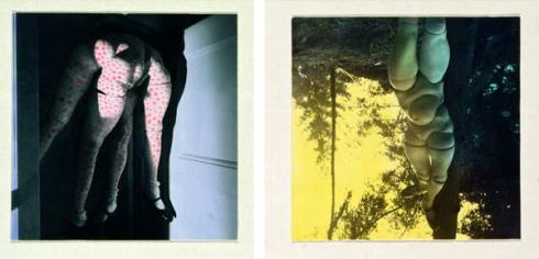
Hans Bellmer, La Poupee Part 2, 1936
Hans Bellmer explores a darker vision. The dolls he has made are gross and distorted mutants. Some have multiple legs and other fused torsos. The viewer is caught between attraction and revulsion. We recognises the parts withing the freakish “whole” object. What I extract from this is the freedom to play with multiples.
My focus has been the male nude and I am disappointed by the lack of similar treatment and interest in the male form. Robert Mapplethorpe noticably bucks this trend and much of his photography, explicit in nature, appear to worship the male form.

Mapplethorpe
I see the muscle groups of the well toned male back as a source for bodyscapes and abstraction. I admire the positive and negative shapes in this

Bodyscape No.11 from serial of photographs “bodyscapes” 2015
Bodyscapes are still of interest to contemporary artists. Two women have been arranged to make a close cropped shot. The buttocks are arranged to suggest hips and the central gap reads as a pubic area.

Guy Denning.
viewed in https://www.facebook.com/guydenning/photos/a.457691977609589.107034.454877254557728/1090882537623860/?type=3&theater accessed 1/12/15
Critical review second version
Drawing2criticalreviewJohn Currin Modern Master
Critical review third version
On 10/11/15 I received tutor feedback and began addressing the issues that he raised.
modernmasterseriouscontender – bryan’s notes
On 20/12/15 I sent my tutor the latest version
Soon after my tutor replied with new recommendations and advice
modernmasterseriouscontender3
modernmasterseriouscontender3-Bryan’s notes 2
Final tutor advice contained in Tutor Report 6 added to the bottom.
Introduction
If you compare Bougereau with Valls it is possible to contemplate a broad chronology of indirect painting with glazing
Adolphe Bougereau
Dino Valls
Since this project has been a voyage of discovery, the shape evolved over a protracted period.So, writing in retrospect, I can indicate the pathway I followed. I began by researching portrait artists employing glazing in their work. Next, I explored graphite as a grisaille for glazing with acrylic. After that, I extented the remit of my project further and attempted to develop my theme using a seven layer Flemish approach popular on social media platforms. This involved Imprimateur, transferring the image in ink,two umber layers,grisaille, and two colour layers. Finally, I considered what the artist Aidy Eaton would do next.
Indirect painting methods applied to portraiture
I began my parallel project by researching the contributors in Suzanne’ Brooker’s Portrait Painting Atelier that professes to expound upon old master techniques and contemporary applications of the indirect painting method. I took this as my set text. There has been a resurgence of interest in this technique with various parties demonstrating the “seven layer Flemish method” on social media.I felt that since I was making a feature of John Currin’s figurative work in my Critical Review, that studying this indirect method, would be congruent and therefore give a more coherent learning experience. Since I intend to pursue expressive and conceptual work in level three studies; I wished to do so having this level of control in my repertoire of technique.
Kate Lehman

Sam Linder
viewed in http://katelehman.net/katelehman/people.html accessed 1/10/15
I love the confidence to leave this piece as a sketch. It shows the elapse of time and the stages of its facture. The palette is earth colours with a bias toward ochre and umber. The flesh is convincing but not overworked.This also fits with my recurrent interest in entropy. If read “forward” the face is being constructed; but “backwards, the image is disintegrating into substrate and ground.
Suzanne Brooker

Bob from glrisailles and glazes
viewed in http://www.suzannebrooker.com/SuzanneBrooker/Portrait_Gallery/Pages/Grisailles_%26_Glazes.html#13
For this parallel project Brooker’s Book is my set text. Here we have a demonstration of the glazed grisaille phase of indirect painting. The modelling is solid and believable. The illusion of depth and solidity of form has been achieved. However, I find her colour dull and her brush handling tight. That said, if I was able to approximate this; I would be very proud.
Glenn Harrington

Harrington: Blue Silk Scarf
viewed in http://cristinafaleroni.blogspot.co.uk/2014/04/glenn-harrington-artista-1959.html accessed 1/10/15
By contrast Harrington displays a brighter light with strong contrasted and wider tonal range. The brush handling is polished and yet still fluid and loose. Admittedly, the face is controlled with much more expansive and bravura in the background and the fabric. I believe this was Singer-Sargeant’s modus operandi although his style was alla prima and not indirect glazing.
Costa Vavagiakis

Vavagiakis: Gioia VII
viewed in http://www.costavavagiakis.com/index.html# accessed 2/10/15
Will Wilson
Valencia, 2006

Wilson: Valencia, 2006
viewed in http://willwilsonstudio.com/portbig15.html accessed 3/10/15
Robert Liberace

Liberace: Old Man
viewed in http://www.bing.com/images/search?q=robert+liberace&view
Patricia Watwood

Watwood, Flora Crowned 2006
viewed in http://www.patriciawatwood.com/figurative/#more-1284 accessed 8/10/15
Robert Armetta

Armetta: Ted
viewed in http://www.robertarmetta.com/paintings-2/page/2/ accessed 10/10/15
Domenic Cretara

Cretara: Woman and Baby, 2004
viewed in http://www.nccsc.net/essays/dark-light-domenic-cretara accessed 11/10/15
I have always admired portraiture and the skill that goes into creating a good likeness. Getting a good likeness may not be the most profound goal in art; but obtaining the skill to manipulate paint and explore the full range of the physicality of paint is unarguably worthy. The full range for me meaning the lightest of transparent stains through to the heaviest impasto application. Thinning paint correctly creates glazes. I am aware that a lack expertise in glazing whereas painting opaquely in acrylic or oil is accessible to even the most rudimentary artist. Glazing is a skill I lack and am keen to develop. Furthermore, is integral to indirect painting methods although it can be successfully applied to any genre.
2. Graphite as a grisaille
Indirect painting is building up a picture in layers and I first encountered the notion in “The Artist’s Handbook” by Ray Smith. 1 (Smith, 2009) 1 On page 69 there is a tinted pencil drawing with a coloured wash applied with airbrush and also by hand. The overall effect was pleasing and inspiring and was a result I aspired to.
![Ray Smith (2009) ‘Tinting effects’. [photograph]: The Artist's Handbook. London: Dorling Kindersley, p.69](https://adrian510434drawing2.files.wordpress.com/2015/02/p3011499.jpg)
Ray Smith (2009) ‘Tinting effects’. [photograph]: The Artist’s Handbook. London: Dorling Kindersley, p.69 2
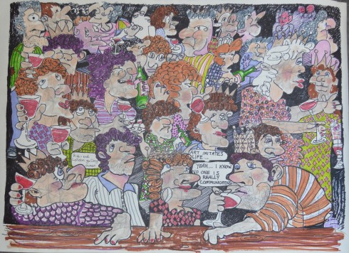
Once I have my technical repertoire and my methodology is well-rehearsed: then I need to say something with it. I am seeing politicians as Class Clowns. Hopefully, an enigmatic title that challenges Class as social order category, with class- an affirmation of quality. Clowns are circus comedians but is an epithet for a buffoon or idiot. So class clown could be a quality comedy entertainer like Harold Lloyd or a pompous twit like Boris Johnson. Class also contains the connotation of education and any “Old Etonian” would provide links from schooling at a privileged educational establishment to political decision making in the upper echelons of parliament. At most broad definition, anyone with decision making powers, performing badly enough to raise suspicions about their suitability to occupy their post. ( In a position of influence screwing up publicly)
Online drawing challenge

First drawing: Una Stubbs
At this point I took part in an online drawing challenge to copy a photo of Una Stubbs and upload it within 90 minutes. This was my submission. It was an attempt at portraiture and monochrome- so fitting my desire grisaille ot monochrome underpainting.
Class Clowns- Posh people making bad decisions

David Cameron- recent revelations have been unfavourable

Cameron 4H

Cameron 2H

Cameron: Graphite grisaille HB stage
I was worried I was losing the likeness because the photo reference angle is odd and the shadows unusual- not to mention the expression distorting the image. Up to this point I had been working simultaneously on all my “clowns” but that was too much even for my naturally disparate mind.There is a shadow under Cameron’s nose that is decidedly Hitler-esque and so I might make a little more of that later.

Class Clown: Cameron up to 2B

Alex Salmond’s independence campaign was mis-guided

Salmond 4H

Salmond 2H
Class Clown- Quality comedians

Benny Hill: Under-rated genius of physical comedy

John Cleese: Legend

Cleese 4H

Cleese 2H
Class Clown- Anyone stupid enough to be in Primary Education (Me)
Grisaille self-portrait
On the 7th and 8th of August I collaborated with the public at Belladrum Tartan Heart festival and incorporated a drawing strategy that might function as a grisaille. I saw that as a multi-dividend.
I have been lucky to have been asked to be UHI’s unofficial “Science Artist in Residence” for four projects. Three at Belladrum and another within Primary schools on the Black Isle. This years theme was super heroes. I felt that the “creatives” that make comic super heroes are heroes themselves. Stan Lee features prominently in Marvel comics and spin offs.
I decided the title for my project should be ” You and Me Versus Stan Lee”. And a portrait of Stan Lee and Myself were needed. Since the purpose of the work was envangelical, in spreading the word about the joy of being creative through art; I felt I had to do some preparation so that I could concentrate on encouraging public participation and try to forget I have an artistic ego.
Graphite portraits
I used a technique commonly seen on the internet call the 5 pencil technique working from 4H, then 2H, HB, 2B and 4B in that order. I modified this a little by mapping out the facial features in a darker pencil and then follow the sequence faithfully. Because it is a procedure it is reassuring that following the steps will almost guarantee a reasonable result or likeness.
4H stage
I have prejudices about pencils and paper. In my OCA studies I am reading “Writing on Drawing ” by S. Garner and I recognised myself in a chapter titled “Pride, Prejudice and the Pencil by James Faure Walker.I favour Faber Castell 9000 series graphite pencils on Canson Bristol Board. I was working large and selected an A3 pad. I printed out photos to 4 x 6 inches and used a Kopykake projector to position the main features. At this stage I have picked my darkest areas and with a 4H and toned the faces to map out the facial planes.
2H stage
I never use my finger to blend but prefer to use a paper stump called a torchon or sometimes a tortillon. Once I have smoothed out all the scratches, I revisit the same areas with the next pencil up (2H) and then go back to the previous pencil (4H) and bring the surrounding lighter tones compared with the earlier work. I follow this procedure moving forward and bringing up the rear until I reach the desired value and then I discontinue using that pencil. Again blending smooth the tones for the skin an makes for gentle transitions. There are other ways to draw, this is only one, and blending is not always welcome.
Self-portrait at HB stage
When I reached the HB stage, I focussed on getting my portrait near finished to the point of eraser work for highlights. Our skin is oily, that’s why I never blend with a finger as I do not wish to introduce oils into the substrate; and reflects light quite distinctly from camera flashes. I decided that I would reserve my grey hair by drawing with an embossing tool. This makes trenches or trought engraved into the Bristol Bord paper. By shading with the side of the pencil at an oblique angle, I can darken the tone at the temples but protect and reserve the white in the embossed trench. The same technique was used for eyebrows and on Stan Lee’s moustache.I made an early attempt with a putty rubber to make irises around my pupils.
Self Portrait with 2B and 4B
Now reaching the 2B and 4B stage, I recognise that the skin tones are approaching the correct value. Tonal variation in the hair and restating feature contours was consolidated. More blending means wear and tear on the surface but the Bristol Board can withstand successive reworking.
Stan Lee
I returned to Stan Lee at this point and tried to bring his portrait to the same 4B stage. I experimented with 5B for the glasses.
Me versus Stan Lee eraser work
Some tweaking with the pencils continued until I was satisfied and eraser work could commence in earnest. Blu Tak makes a putty rubber substitute, pencil rubbers exist. A pencil with a rubber core and these are ideal for contouring. They can be sharpened in the usual way or with a craft knife. A craft knife means vinyl rubber can be cut to specific tasks and electric erasers, being most abrasive, can be selected for the harshest highlights. I sometimes make these sparkle with the late addition of white acrylic ink. I believe Louise Bourgoise did this in her drawings ( according to Petherbridge in her book “The Primacy of Drawing p.121” but I opted not to.
At this point I still believed I was going to use the drawing as a grisaille under painting for acrylic glazes. This would not be the case. Also, I believed that I would open the skulls and leave a lid like a pedal bin mid-action but abandoned this idea subsequently.
Finally, I decided to photocopy my originals and play around with the toner setting for darkness and contrast. The works development and subsequent blog was featured in Weareoca.
http://weareoca.com/fine_art/you-and-me-versus-stan-lee/
Making Paintings with watercolour or acrylic glazes
Since I am using my drawings as grisaille I am at liberty to use repro-graphics and change scale while reserving my original drawings intact. At the outset I was resolved to seal a photocopy, xerox or scan using clear acrylic binding medium before applying glazes. It later occurred to me that watercolour tinting of an etching may also be a useful development and I live near the Highland Print studio. I have options for developing my work to obtain multi-dividends.
I have now fulfilled the remit of my self imposed brief. However, this work, though complete in itself, opens up the possibility of further development in oil painting using what is popularly called the seven layer flemish technique. This intrigued me and I was keen to pursue it.
Making Flemish Oil Paintings:Technical Notes
I decided that I should combine liquid media with gryffin alkyd oils
Additionally, I decided that the gound and umber stages could be acrylic to speed up the process and save on cost as acrylic is cheaper than oil.
Palette
I encountered Color Mixing Recipes for Portraits by William F. Powell at this juncture. It is something I will have to study in greater detail later in my studio practice. This book introduced me to the notion of a master recipe from which others are derived. It also swamped me with a staggering array of skin type classifications I had hitherto been oblivious to. I must look closer at people. On page 16 a skin tone recipe for caucasian (creamy tones) using tit. white, alizarin, viridian, raw sienna, cad red light is exemplified. I see skin tones in terms of these colours automatically and many of these colours are standards in beginners oil and acrylic kits. They are familiar. I began to think in terms of warm and cool shadow and the idea of a complementary graying colour was helpful. Less paint means savings and so I made a decision early on to limit my colours to what is called the Zorn or Rembrandt palette of black, white, yellow ochre and alizarin crimson to improve my colour mixing/ seeing ability.
I looked at online catalogues and in Mayer’s Handbook to discover there are varieties of black and white with technical specification that need consideration before their use in grisaille or other applications.Mayer mentions two blacks pigment black 9 and pigment black II. From these there are multiple common names, ivory, carbon, bone, mars and the problems seems to be exacerbated by various brands making distinctions in their product labelling. Similarly pigment white 1, 4 and 6 yield various epithets suchas; flake,lead, Cremmnitz (favoured by Freud) silver white, zinc, chinese and permanent and titanium white. The two I am familiar with are tit. white and zinc. I know from experience the zinc is a good “mixing” white. Mayer’s attention to pigment characteristics appeals to the scientist in me and I will endeavour to read my lael more thoroughly.
The task was partly redundant since I would use the colours I had- but the accumulation of knowledge and experience is important particularly if, as I do, you see a didactic function to your practice. Perhaps one day I may be an OCA tutor myself. If I am being faithful to Old Master reproduction, I know I should gravitate towards flake white according to Brooker.
Alexei Antonov of http://www.artpapa.com describes the whole process sequentially and demonstrates this on a step by step canvass product he has devised to aid beginners
Delmus Phelps, George Ayers and others use youtube social media platform to demonstrate and document their processes.
Grounds
Flemish Portrait: Toned Grounds of the Old Masters
According to Brooker’s text; ” Certain hues are traditionally associated with the toned grounds of paintings by the Old Masters.” ( Brooker, 2010, p.61)
A sampler featuring Burnt sienna, Gray, Red-green, golden, green and burnt umber grounds are explored. Already an almost bewildering selection I am automatically drawn to the soft gray, the ochre and umber grounds and averse to the plummy red-green ground and the strong burnt sienna. I have noticed an aversion to strong red.
Flemish Portrait: Ink Transfer
With new technology it is now possible to “do” line work with acrylic marker pen negating outlining with a rigger in permanent ink. Liquitex and montana are two companies with acrylic pedigree and broad catalogue of resources.
Flemish Portrait: Umber layers
Michael Fullerton (1965- )

Michael Fullerton
An Unexplained Mystery, Not Broadcast on CBS’s “Unexplained Mysteries” (Roberto Calvi) 2010
I included this piece as it displays a modified umber underpainting manipulated to presented as a finished piece. Those who endorse the new Flemish would have this “look” as a starting point. And so I had a go for myself to see where my starting point is.

Burnt umber underpainting in style of Michael Fullerton
I created an outline drawing with burnt umber ink applied with a rigger paintbrush. I noticed it was too responsive to the vagaries of my hand. Once this had dried I made an olive colour using black, umber, red ochre and cad yellow. to stain the canvass board. This had the effect of softening the lines I made an nocking them back. Then the piece was merely “shaded” using burnt umber with griffin alkyd oils and liquin as a medium. The liquin accelerates the drying time of the paint. The glazes on the face are so thin the weave of the canvass is visible.
Flemish Portrait: Grisaille layers
Edelfalk
Flemish Portrait: Colour layers
Who is the artist Aidy Eaton?
I feel I have lost myself on this journey. I realised this when a colleague asked is there an end product to all this work? I may have discovered or rather develop some skill and accumulated experience. I am doubting the communcative power of flemish.
Michael Forbes
Clowning Around
Vishai Jusadman

Vishai Jusadman: J.A.
Vishai Jusadman (1992) “J.A from “Clowns” series 1991-2”. [photograph] Vitamin P: New Perspectives in Painting. London: s.l.: Phaidon Press.p.160
Clowning is a mask and often conceals identity. Many fear clowns and perhaps deception and trust is at the heart of the matter. Clowns are aware of their audience and their public perception. It is an act. An illusion. Many comedians are deeply unhappy in private. Tony Hancock for instance. The idea of the phoney or fake is of interest to me. Politicians are equally managers of the public perception and are not what they appear to be. Their motives are not always apparent and scandals are rife in public office.

metamorphosis
Jose Luis Corelia Garcia (2008) “Metamorphosis”. [oil on wooden board] 500 Portraits: BP portrait award. London: National Portrait Gallery Publications. p.263
We all wear masks. This has the look of a clown whitening the skin and reddening the lips. Where a mask hides the face and perhaps hides intentions; this mask reveals the individuals purpose. She explores identity and questions self wishing to see herself as oriental. Many orientals take advantage of an operation to make their eyes more European. It is the reverse here. Wearing the mask reveals rather than conceals. The appearance is that of a Geisha.
Conclusion
There is a sense in which all art produced by an artist is autobiographical. It detail interest, passions and obsession as a catalogue of opus. I have learned that while the development of technique is commendable; it is not necessarily an end in itself. I like the fine polish in John Currin’s later work. The fact is that fine rendering of surfaces does not necessarily communicate anything to the viewer other than the artists’ skill. There is no doubt pleasure to be had admiring the skill of an artist. In their ability to copy faithfully the world of surfaces and textures around us all. That which we call mimesis and the pursuit of verisimilitude is in essence copying.Copying is not creating. But what I seek in my own work as I enter level 3 studies is COMMUNICATIVE POWER.
I have lately discovered two artists I admire while engaged in my parallel project. Alice Neel whose portraits are deeply psychological. She paints her assessment of people who sit for her; and Dana Schutz who allows her imagination to wander and explore imaginative streams of consciousness that for me has a lineage going back through Surrealism to Marc Chagall. Her paint handling reminds me of Chaim Soutine but her colour palette nods to the fauves but especially Maurice De Vlaminck and Kees Van Dongen.
I love figurative work, portraiture, and word play. I return to self portraiture because it is psychological and biographical and because my art is essentially about what is important to me. Making my meaning visible so it can be understood.It is in my creative DNA oscillate between genre and style. Consequently, the appropriations of Glenn Brown who plunders the whole spectrum of art history in his reinterpretations appeals to me. I refuse to be pigeon-holed.
Where do I go from here?
I enter level three with confidence and yet a growing sense of frustration that my studies are too small for me. I desire greater creative freedoms and control over the direction of my work. It is not about slaying the parent OCA. The college has done its job in instilling the sense of identity and confidence that comes with strong theoretical underpinnings.
Bibliography
Final Piece- October News
Reflective Account (800)
I had a tutor change at Assignment 4. No momentum was lost , indeed, my first ever Skype tutorial left me motivated.
Project 1 A changing scene
This topic was problematic since going public is fraught with anxiety. Additionally, being November so far North makes street drawing a chore. I preferred to use domestic scenes, a favourite subject, and record changes in body posture. Research introduced me to Jennifer Pastor, and her clean contoured work that then influenced my direction. Playing with templates, (I do a lot of playing) segued neatly in ideas aligned to Futurism that I returned to in Project 3. I realise that my preference is to use photographic references and this will definitely feature in my Level 3 development. Duchamp, Richter, Karen Kilimick and numerous others all exploit the potential for photographs to freeze time and permit reflective inspection. Indeed, reinterpreting photographic techniques as paintings could constitute a Major Project and because of media’s ubiquity contexualising work should not prove problematic.
Project 2: An Artist’s Book
The notion of an artist’s book was foreign to me. It took some research to work out the potential other atist’s see in it and I recognise, although I am better informed, it is not an aspect of artistic expression I am interested in. Consequently, I worked harder to produce four “books”. I focussed my attention on artist’s whose work was Semiotic in nature or who I felt were going to be useful in my Level three work. Beuys, Nauman and the like. Typically, I tried to explore subjects that embodied aspects of entropy. The Killer butterflies was about making new species out of cancer cells and the beauty of intelligent design- even in viruses.
Inspired by Helen Chadwick’s viral landscape I sought to explore beauty in design detached from the emotive issues of suffering.Similarly with the Entropy and suffering for your art, I used Nauman’s format of sequential destruction (mascerating a pencil by sharpening) to comment on how artists put themselves into their work. Like cell design, art is not arbitrary. I also reviewed my journey as a student in a cognitive map and explored my nightmares through drawing in a liminal state between wake and sleep. Even the most casual reader of my blog will detect Insomnia Incident self portraits as a idee fixee.
Project 3 A finer focus
I got off to a false start using oil pastels for tins of sweeties. There were two aspects. Imagined personal response and observed drawing. In Bye now, Bynoe, the actual words from an argument were used to search for images on the content of the debate. I drew on top of the existing lines until a cartoon emerged of a social gathering. Once the picture developed, the image was embellished and a caption added. This was an example of automatism in drawing derived from Dadaism.
I made a sequential self-portrait of various expressions from despair to anger. It was observed drawing exploiting photographic reference but extending it through a multiple exposure and overlapping that tied in with movement in a changing scene.
Project 4 Time and the viewer
I find it difficult to concentrate for any length of time. Focus is an aspect of stamina but; due to the slippage of words and meaning, finer focus is also zooming in to microscopy. The combination of science and art, historically disparate disciplines, fascinates me. It put me in mind of Duchamp’s “art co-efficient” where aesthetics may be measurable.
I explored Futurism in the flight of a hummingbird inspired by Balla and Boccioni’s dynamism. (Hummingbirds are a recurring theme for me.) It suited my love of entropy as the images become increasingly fractured and chaotic and the viewer requires more time to makes sense of what they see. They were time consuming to make but while I was engage in them, time passed differently. This is a facet of the liminal- being in the zone- that one loses track of time.
The course as a whole
The curriculum has been very broad.Responding to the remits accurately has resulted in suggestions that my work is disparate.The course has been designed to extend the boundary of what drawing is including performance and installation. I have felt frustrated at “having to let go of the brush” and long for Level 3 when I can set my own agenda.
Project one- A changing scene

Muriel on the move “Dynamism of a tea drinker”

A4 Sketchbook: Muriel on the move
Project Two- An Artists’ Book
” Entropy and suffering for your art”
video 2 on G Drive. Amendment added 26/2/16 with permission from assessment team
Liminal Book: “Treasures of Insomnia”
video 1 on G Drive. Amendment added 26/2/16 with permission from assessment team
Project Three- A Finer Focus
Narrative- Bye Now Bynoe

A finer focus on expressions
Sparrow
Project Four- Time and the Viewer
Dynamism of a hummingbird

colour added
Code art
Representative Sample- This Blog
Contextual Focus- Frank Auerbach portraiture: see Part 5 Project 4
Parallel Project :see part 6
Critical Review: see part 6
Reflection against criteria
I am aware that this self analysis is summative. I recognise that the word liminal, that has become a feature of Part 5, applies to my status as a student. I am on the threshold of level 3 and from that vantage point can appreciate the journey I’ve made while anticipating what lies ahead. Consequently, this summative self-assessment has to display my readiness.
Demonstration of technical and visual skills
It is true that I encountered graphite powder during the course. There are developments in the technology of art materials and it is necessary to keep abreast of these. That said, anything can become an artists media. The skill lies in matching the media and techniques to your expressive intention. I learned this from Cornelia Parker. In this respect, success can be said to be measurable. An understanding of appropriateness or suitability of media can be developed through experimentation we call play.
This course encouraged me to appreciate that it is possible to create by destroying. The erased de Kooning exemplifies this. This means that works may be less than perfect and this introduces the idea of anti-aesthetic. There is beauty (of sorts)in ugliness. I learned through this course to let go of mimesis or representational verisimilitude. Blind drawing in particular helped me to free-up mark making. There artist’s like Cy Twombly and Jean DuBuffet that shun technical excellence in favour of primitive freshness and the freedom that affords. I learned to relinquish precision and control through drawing machines. Robotic perfection in a drawing can be expressionless and the imperfection of the human can produce the uniquely expressive.
I enjoyed drawing to music and translating melody and rhythm into marks. Picasso said to draw, close your eyes and sing. I recognise that it means be do not need to be dominated by visual stimulus and that music promotes lyricism in the quality of mark-making and line.
A sign of my developing voice, a work in progress, is the conscious acknowledgement that I resent working in the style of other artists. Figuring out who you are by eliminating who you are not is wasteful and my time is precious.
Quality of Outcome
My studies have made me reassess what quality means. Formerly I would have equated it with technical excellence, realism or traditional notions of beauty. Quality may be the characteristic of the image whether crude or refined, cluttered or minimalist, etc. I equate quality with depth of thought or communicative power. Is the message succinct or elaborate. With my own love of entropy, I favour the disintegrating image or works that are plural and multi-layered. I appreciate sometimes the work needs to be explained by text. Is this not true of Duchamp’s glass piece? At other times ambiguity is necessary to explore possible meaning, develop narrative reading or encourage the viewer to spend time.
I believe that my blog is coherent. It makes sense to me and conveys my thinking and problem solving clearly. This is important ans especially now. Coherence means that you demonstrate you understand what you have encountered. That what you have assimilated makes sense to self. That way learning is measurable and success in the teaching curriculum measurable. The blog demonstrates what is assimilated makes sense to other people. I am aware that as a practitioner I envisage a didactic function to my studio. I imagine workshops and lessons and sharing through social media post OCA. I write my blog so that I engage in a dialogue with myself- to find out what I truly think. Through this process I realise entropy, semiotics and the liminal are regular features that determine my aesthetic preferences and influence my choices. My reader may walk the journey with me through my writing, see through my eyes and think through my thoughts.
Demonstration of creativity
My interest in semiotics, entropy and now defining the liminal has been a unifying theme to my work. I have assayed to show these ideas in multiple embodiments; personal, social and cultural decay. I have been successful. My assignment 4 made it onto the cover of a local newspaper and onto the weareoca blog in a section called captured your creativity. I expect to be inventive being a noisy artist an using media as a marketing tool in Level three studies.
I have exploited futurism and dadaism in assignment 5 to show I understand those movements and their guiding principles. I draw in different styles, not because I am disparate, I refute that, but because different ideas need to be communicated differently. By Now, Bynoe is an automatic drawing (Dadaism) based on the words of a disagreement with a London art gallery owner. The dynamism hummingbird piece (Futurism) exploits multiple overlaid stencils to show movement across time.
Context
Reflection
I know I am a reflective practitioner. This has become a habit through blogging for OCA courses and in my professional life as a Primary school teacher. When I reflect, it is more to do with my intention to communicate than technical problems and how I approached them. Curiously, the opposite was true in watercolour practice when problem solving and use of media was my prime focus. Truth is I am familiar with the media and techniques that I commonly use. It is much more important to monitor how you know you are being influenced by what you encounter. Knowing how you know is called metacognition in cognitive theory and was the subject of an artists’ book in Part 5. One of four.
Reflection is critical to discernment. I know I am closer to Alice Neel than Alex Katz. I prefer Pearlstein to Fischel and see Uglow as their resolution or synthesis in figurative nudes. Discernment means that now I am ready to make an artists’ statement which is one of the first things in Level 3 Major Project. Discernment as monitoring your own interests and standards will encourage independence and ensure progress.
Research
Critical thinking ( learning logs critical review and essays)
I have read all the course literature and recommended reading except for Berger on drawing. At level 1 I read to learn new things and encounter artists and movements. In level 2, I read to find things that I think are useful to me. I am actively looking for what I want and this is evidence of voice. Sifting what is relevant implies knowledge of who you are and where you want to be. I am chaffing at the bit to graduate to Level 3 and my frustration and impatience I take as readiness. I am not complete. I need to read more but more selectively. I will probably pursue Duchamp and semiotics and already have an interest in Derrida and Baudrillard. I know you can hold a guitar and not know how to play it. Similarly with these philosophies. I am aware of their importance but do not fully understand. I expect I will be a perpetual student and art will be my teacher.
Tutor Report 5 19/12/15
I began with research by looking for examples that fit the logic of my predicted categories. I found the course set text invaluable and plundered these. So many examples exist with fairly casual research.
Some art is obscure and takes time to work out the meaning
Some make us flick through views like a sequence of stills to encourage us to direct our own move
Eberhardt Haverkost

Havekost: Sniper 1-3
Havekost, E. (1998) ‘Scharfschutze 1-3(Sniper 1-3)”. [oil on canvas] Vitamin P: New Perspectives in Painting. London: Phaidon, p.135
This piece is a tryptich. I find myself reading the “action” in different directions and playing my movie excerpt mentally in multiple versions. I look longer because I am exploring options.
Dubossarsky & Vinogradov

Dubossarsky, V., & Vinogradov, A. (2001) ‘Long painting”. [oil on canvas 22 panels] Vitamin P: New Perspectives in Painting. London: Phaidon, p.098-099
These artists keep the viewer busy with multiple panels that mentally arrange a panorama. It reads as a book, left to right, and displayed in this book- from top to bottom. It seems to present an idealised arcadia with heightened colours, heavily saturated. The idealised image is subverted with surreal displays of maiming going unnoticed in the protagonists. Nudity adds mild titilation. I found myself trying to read how the characters relate to each other in this imagined space.
Ellen Gallagher

Gallagher, E. (2001) ‘Fails and Flips”. [paper, plasticene and polymer] Vitamin P: New Perspectives in Painting. London: Phaidon, p.118-119
Gallagher presents multiple images that almost overwhelm the viewer with detail. I find myself oscillating between wishing to read every single portrait or standing back and reading the sum of the parts. The discreet images make me feel I am reading a language of heiroglyphs with cartouches contained within their own field/ space.It took commitment to read every individual element and I was reminded of terms and conditions that most people skip over. Gallagher is testing the viewers ability to look closely while delivering her actual message about ethnicity.

Di Matteo, G. (1997) ‘Arafat”. [oil on canvas] Vitamin P: New Perspectives in Painting. London: Phaidon, p.082-083
Di Matteo’s work forces comparison with almost identical pieces that stages a large scale spot the difference. The three sizable canvasses, 205 x 145 cm each, would have to be read at a distance to force comparison and up close to contrast in the minutia of their construction. The viewer would be occupied looking for similarities and differences while walking back and forward to change focal length. This amuses me as a performative dance in space that also makes the viewer use time differently.
Edelfalk

Edelfalk
Edelfalk, C. (1992-4) ‘Echo ( from the “Self-Portrait” series of 12 paintings”. [oil on linen] Vitamin P: New Perspectives in Painting. London: Phaidon, p.102-103
Edelfalk holds the viewer’s attention by playing with scale and with orientation. The repeated image invites comparison but playing with scale means that it is not like for like straight comparison. If the large centre panel is the original then the shrinking or diminishing panels make sense of the title echo which is a diminution of sound. The inverted panel means we have to perform mental gymnastics for spotting the difference. The shapes at least are reasonably recognisable but a process of translation is required to make sense.
Cecily Brown

obscure
Brown, C. (1999) ” Dog day afternoon”. [oil on canvas] Vitamin P: New Perspectives in Painting. London: Phaidon, p.046-047
Brown slows down viewing by obscuring the image. There is little representational for the eye to latch onto to decode the “message” and the title, Dog day afternoon, offers little support. Awareness of major themes of other works means that we should try to identify body parts disguised and distorted, or indeed, force us to question what exactly we do see. I am reminded of a Rorschach blot test and the text of Vitamin P supports this.
Obscuring with drips

Amer, G. (1999) ‘Red Drips -coloures rouges”. [acrylic, embroidery and gel medium] Vitamin P: New Perspectives in Painting. London: Phaidon, p.038-039
Obscuring the view makes the viewer look harder. Amer embroiders images of “female pleasure” and then obscures by letting the stitching run free. The threads are then fixed with gel medium and presumably the drips of red acrylic on this image are added last. Acrylic is verastile and the order may be reversed. Red speaks of passion. Overcoming these obstacles, the male gaze is rewarded with porn. The work is a critique of the male gaze and also of a culture of censure.
Katy Moran

Moran, K. (2009) ‘house”. [acrylic on canvas] Vitamin P2: New Perspectives in Painting. London: Phaidon, p.215
Sometimes the theme is so obscure that the viewer spends more time looking in order to make sense. I find that I am looking for a narrative.Now I see there is no one, I am merely enjoying the formal aspects of colour, pattern texture and so on. I decide whether the resultant fusion of these aspects on the substrate is pleasing or not. I like what I see and enjoy the physical properties of paint deployed on the substrate
Benjamin Degen

Painting
Moran, K. (2010) ‘Brevis”. [oil on linen over panel] Vitamin P2: New Perspectives in Painting. London: Phaidon, p.087
The message is in the title brevis. From, ars longa vida brevis meaning life is short but art lives long. The skeleton now makes sense as a memento mori. The image is highly decorated with a sort of pointillism that the image of the skeleton has become fused with the surrounding and embedded. The texts wittly reports a time- lapse decomposition.
Another strategy
Another strategy is working on a so large a scale so that it takes time to take in as in large scale installation art. I immediately think of Anselm Keifer.
cite Marco Maggi and Daniel Zeller p.332 in Vitamin D
Dr. Lakra
viewed in Vitamin D page accessed1/3/15

Dr. Lakra(2004) ” Untitled (4.90)”. [photograph]: Vitamin D. London: Phaaidon, p. 168-9
This piece helped formulate an idea in my own mind. A drawing could be built up progressively over an extended period that would document ephemera. I resolved upon the notion of using reference material from media, social media and the wider online community.
1. Sufficient unto the day…
…is the evil thereof. Collect daily evidence of evil in the world to make a scroll of evil. Outline the events transferred on to the scroll and complete the drawing in a public filming the performance and engaging with audience. Invite leaders of churches to add biblical commentary to the months events. Burn the scroll and collect the ashes. With the ashes write “Sufficient unto the day is the evil thereof” End filming.
2. The viewers share
The title comes from a chapter in Gombrich’s “Art and Illusion”. The viewer is active in the viewing process supplying the want of information with their imagination. Here the audience is asked to paint an acrylic print backing paper with clean water. As it soaks in the image is revealed temporarily. It is believed that viewers look at art for a maximum of 8 seconds. This activity woul make the viewer literally active in the process and take time to read what they see. This is time dependent since as water evaporates the image is lost.
The viewer’s share
class clown variant
The acrylic transfers are of “hated” politicians/ public figures. eg Cameron or Farage as clowns (see parallel project)The audience throws wet sponges at the backing paper. As it soaks in the image is revealed. It then becomes apparent that the participant has been throwing at a “hated” figure.
Month of Sundays.
I am planning ahead for my later studies in D2: How many Sundays do you think are meant in the phrase “a month of Sundays” I know mathematically anything from 28-31. Without influencing your thoughts I take it to be 28
Vanessa Parkinson take it to be infinity, ie it will never happen.
Michael Whyte 58.33% of all months have 31 days
I did not know how to proceed as with much of Part 5; it has taken time for the strategy or approach to settle and become resolved in my mind. The phrases ” forces the viewer to use time differently” and may need an investment of time by the viewer” became a stream of consciousness that occupied my thinking. I determined that I should slow the viewer down. Additionally, there had to be a congruence, coherence and continuity of my work throughout my Drawing 2 studies. My default setting has been the visual pun so perhaps this would help me address the exercise and explore my relationship with my viewer. How do I wish to relate to my audience?
I was problem solving. Once I realised this in myself I reckoned that problem solving would occupy my viewer as well. A visual pun could entertain and amuse but I realise also that it can be a way of generating thought and recognition in the spectator. Bruce Naumann taught me that it is not wrong to annoy or frustrate your viewer as a measure of success. Is this not what Banksy has done recently with Dismal Land? I speculated that success would be to create any feeling in the audience at all; and that failure was if the viewer felt nothing at all. Strong like was preferable, strong dislike acceptable but apathy was failure.
The polar opposites of like (amuse/ entertain) and dislike (frustrate /annoy) were my goals and to do so through visual pun based on the notion of problem-solving. I immediately began brainstorming time through words, phrases associations poetry and prose.
Cite brainstorming here
Drawing with a date stamp. (Anish Kapoor)
I had a breakthrough when I read the literature. Reflect on the time spent by the viewer and how it relates to you as an artist. I did and to understand a phrase I often ruminate on the opposite when I get stuck. So that gave me “Reflect on the time spent by the artist and how it relates to what you do as a viewer.” Well as a conceptual artist I play around with meaning and words. I spend time thinking strategies and ploys based on language and what can I do to get the viewer involved through problem solving. By reversing the statement I had substituted two words. If I substituted all the words, giving them equivalents, I could make word and picture codes and cyphers for the audience to crack. Solving the puzzle would reward the effort through amusement and realisation forcing them to look hard, read and decode the message. This all would take time. The artist and audience would collaborate to make meaning. If the message was about time wasting, the realisation that they had wasted their time would be disatisfying. eg If you notice this notice then you’ll notice this notice is not worth noticing. Is half-way being mildy amusing. Neither a great reward nor a significant frustration.
The brainstorming was then sorted into rewarding or other experiences.
Codes and Ciphers that reward
Probability
Codes and ciphers that “punish”
Back to the Futurists
I liked the “dynamism of” pieces by the Futurist Balla and Boccioni I encountered in my contexualising research.I felt that the confusing faceting of shapes held my interest as I tried to decode what I was looking at. Sometimes the title is the only clue. I recognised that this was an example of the viewer using time differently in the decoding process.The theme of futurists work is motion and speed and noise.

A3 sketchbook: Dynamism of a hummingbird
The theme of mine appears to be a hummingbird’s flight path. It is actually a study of disintegration of form and a simple image, a hummingbird template, becoming fractured towards complexity. A tendency towards chaos. I made a template of sturdy card and traced it at differing interval we call frequency. Frequency is a frequency of waves in sound and this hummingbird, that gets its family name from sound; is shown making a wave pattern across the page. So yet another embodiment of entropy shown as a visual pun.

Futurism: Dynamism of a hummingbird 2
The image is more faceted with diagonals and chequering. I feel myself looking and trying to trace the outline from the positive and negative shapes. Consequently, as a spectator of my own work, I am spending my time “reading” rather than viewing the piece. Therefore, I conclude that this is the way to go.

dynamism of a hummingbird 3a
I added extra laser faceting and worked on a much larger scale.At this stage I realise that it could become too difficult to decode. I felt it necessary to add a visual prompt to decoding and resolved upon a ruby throat embellishment. Knowing where this is helps the viewer infer where the rest of the body is to be found.

Full Imperial loose leaf: Dynamism of a hummingbird
The pink, I may add cad red later, helps the eye undulate and trace the route of the flight.
Assignment 5 piece
October Feast
Plan for my Drawing 2 Assignment 5 piece. I had to darken the image and play with photo-editing. I tried for one news story for every day in October 2015. This image was inspired by Dr. Lakra’s work in Vit D.
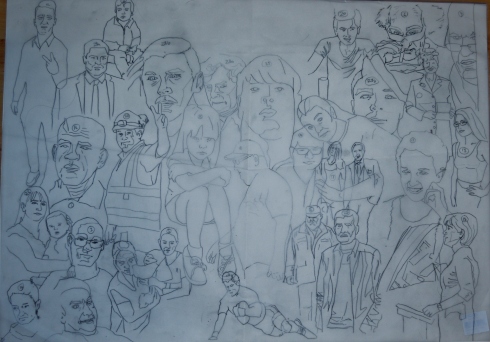
I selected stories from the National press every day in October 20015. I chose after a quick scan of the paper to capture what was influencing most. I did this to get a more visceral reaction. Gut instinct. I traced the images working from large to small but not necessarily chronological order. I tried to get an example for every day but the stories that interested me were sometimes covered on consecutive days.
Transfer

I used graphite powder to aid the transfer process. When I was over drawing I was aware of the line quality becoming solid and determined. I made a conscious choice to vary the pressure and add accents to add expressiveness to the contour.I cleaned up the residue with a putty eraser and protected my hand with a sheet underneath.

Drawing 2 Assignment 5 first rendering session. Faber Castell Polychromos Magenta (133) on A1 cream mount board. I felt anxious rendering this. I wished to leave it as a hollow contour but it felt unresolved. This was my discernment communicating with me. I trusted my instincts and looked forward to the second session.

The second session was slow going as I felt the pressure to maintain a standard across the multiple figures. I became more aware about how the figures relate to one another. Additionally, I began to look for tonal balance across the sheet. The the darkest darks and lightest light were equivalent.
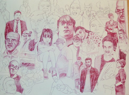

Auerbach: Catherine Lampert 1981-82
Bibliography
Artists who work in a meticulous way.
I found Vitamin D very useful for this project. There were numerous examples from which I have selected a few for my personal short list.

Alvarez, D.L.(2004) ‘\\\”. [graphite on paper] Vitamin D: New Perspectives in Drawing. London: Phaidon, p.012
The subject is Ruth Ann Morehouse, a member of the Manson “family” just before the murders of 1969. Jordan Kantor’s text states that Alvarez “pinpoints the precise cultural threshold when utopian dreams ans innocence gave way to darker realities.” Curiously fitting in a different embodiment, my continuing interests in entropy and liminal pairings in art. The drawing is gridded and shaded to give a pixelated version of a photographic reference.

Caivano, E.(2003) ‘Fraying the ropes”. [ink on paper] Vitamin D: New Perspectives in Drawing. London: Phaidon, p.052
The image is highly detailed and built up of accumulations of thin lines that illustrates a narrative fantasy of the artist’s own devising called “In the woods”. All manner of exotic and imagined creatures are encountered fusing imagery from medieval, futuristic and natural sources. The image has a clean illustrative feel.

Noble, P.(2000-1) ‘Acumulus Nobilitatus”. [pencil on paper] Vitamin D: New Perspectives in Drawing. London: Phaidon, p.221
Nobson Newton is an imagined city of the artists own devising. The title is humorous development of his own name and , as the text suggests, a powerful cultural metaphor for society, ordered and happy or chaotic and dysfunctional.

Greene, M.(2004) ‘666”. [ink on paper] Vitamin D: New Perspectives in Drawing. London: Phaidon, p.117
The image is densely populated by tiny figures in an orgiastic bacchanal of of intertwined and sexually engaged figures. It is a dystopian society exploring hedonistic excesses as the title, 666 suggests.

Serse.(1999) ‘Vertigini (Dizziness)”. [ink on paper] Vitamin D: New Perspectives in Drawing. London: Phaidon, p.281
Serse draws land, water and forest in a photo-realistic style. His mountains recall Japanese prints. His technique includes reductive drawing by erasing into a graphite base. The text suggests an ethereal or spiritual quality to the works.

Siena, J.(2003) ‘Lighthouse variation with crosses”. [graphite on paper] Vitamin D: New Perspectives in Drawing. London: Phaidon, p.293
A connection between Siena and Sol LeWitt was unearthed in this research that I am attracted to. Each of Siena’s pieces is drawn according to a self-determined remit or design brief. It is , in a sense, self- programming and reminds me of my studies of Drawing Machines in Part three. This aspect which includes “algorythmic” connects language to art and stimulates my interest in SEMIOTICS.
My research uncovered an artist called Robert Strange whose artwork very much addressed the remit of this task.
http://www.robert-strange.co.uk/
Robert draws collections of things based on a theme, buttons, playing card and so on. I decided to look at sweets in the same way.

A Finer Focus 4
The assignment required detailed work and permitted repetition.
First I went to a photocopy “shops” and asked for laser scans of four photos of the tin of sweets after multiple shakes.

Sweetheart
Then I cut and collaged to make a sweetheart. I now recognise that a lot of my experimentation is just artistic play. What if… followed by investigation into media and techniques to make it happen. This time I know I am simply tracing to get a line version without colour. The tracing will take a long time and will tax my patience and my stamina as my ME condition limits the application of energy. Curiously, I am amused at that since the sweets are full of calories!
The phrase time-consuming entered my head and I imagined this pile diminishing across time like successively recording it being devoured. I regret I did not make this an artists’ book of a visual pun.

Oil pastel layering
After a while I regretted my choice because the shapes did not translate well. I contemplated giving up. Then I realised I was avoiding risk-taking because I felt uncomfortable and feared failure. I decided to persevere partly because of this realisation and also because I had not used oil pastels as a drawing medium and sought the opportunity. I realised to make the task manageable I would have to zoom in.
I reappraised what finer focus meant.
Finer focus meant controlling lots of details. To do this I mistakenly zoomed out. However, I came to interpret that as looking more closely and then zooming in. Microscopy allows us to see what is invisible to the naked eye. Cameras have a macro function to zoom in with out the need for an electro-microscope, but the microscopic does fascinate me.

Inspiration for fine detail
viewed in https://www.facebook.com/Milliartportraits/photos/a.320915761385374.
1073741841.320450761431874/739612069515739/?type=3&theater
accessed 7/11/15
observation
The course material is what guides the direction of my work. It speaks of observational work and I resolved to explore this through a series of self portraits.

Entropy expression: Anxiety
I am exploring entropy again. This embodiment of the concept reflects aspects of mental health and declension towards depression. I used photographic references with my face imitating various psychological states.In this first I am tearing my hair out. This piece, being the centre was most fully rendered in graphite on my lining paper. The lining paper distresses quite easily and I was afraid to overwork areas. Additionally, I sealed the drawing to avoid smudging but the perfix spray introduced cockling to the surface.

Entropy expression: antagonistic
Here I am being confrontational and gesturing my defiance. This is not the most emotionally intelligent way to handle differences with the world. It was proving difficult to find the face in the overlapping section. Then balancing which details to accentuate and which to relegate was a dark art. This image was less well render, more feint to emphasize entropy being disintegration. Towards the outsides the drawing will be most feint.

Entropy expression: regret
I end this side with regret and recrimination. The narrative may suggest regretting the militancy of the adjacent portrait.Of course it is a visual pun about the accusation of being disparate in my work- showing many faces. Conversely, self-portraiture is a default setting for me that ironically speaks of continuity. This piece has the loosest mark making. Very scribbly. I am contemplating reductive erasing.

Entropy expression: despair
The new portrait is looking heaven ward. At this stage, I have learned to imaging how the features will interact when the are placed and anticipating this much more effectively.
Entropy expression: frustration
I end with frustration as I approach the end of my Level 2 studies and stand on the threshold of a level 3 Major project.

Alternative
Horror, defiance and revulsion look differently in the context of the French flag and the atrocities of 13/11/15.
invented
extended doodling to describe a narrative ( reading between the lines= speeches)
Bye now, Bynoe

Communication breakdown
Communication breakdown and misunderstanding of meaning as yet another embodiment of entropy. The words of an argument written randomly on a page. I am hoping to find imagery from the argument by staring into the mess. Potential for extended doodling.

using existing lines
I stared into the mess, emptying my mind and being receptive to any influence. As shapes appeared I inked them over to to clarify and fix their position. I worked from top to bottom modifying the scene little by little and in response to forms as they appeared. I decided not to worry about accuracy of drawing since cartoons and caricatures seemed to be developing and they permit distortions.

colouring on top of the existing dialogue
Im made a decision to colour on top of the scribbles so their history could appear/ be recorded. I am attempting to stamp order upon the chaos, and a party developed but curiously, in a piece about the breakdown of communication, no one seems to be talking. Psychologically significant I think.

Communication breakdown: By now, Bynoe
At this stage I decided that the drawing armature of scribbles should be neatened up a bit, but the process is important to the message. That the shapes developed out of words and argument based on misunderstanding that just goes to prove talking over one another is never any use! All words seem lost and no one has heard the others point of view or remembered it.

extending the doodles
I believe in this methodology though it is high risk drawing strategy. Mimesis is a desire for realism. The brain naturally seeks to make order out of chaos and needs the minimum of prompts to work upon the imagination. Leonardo realised the potential for inspiration in the patinas and stains of an old wall; so from the mess of scribbled dialogue I sought literally to read between the lines (deduce meaning) to see what emerged. Since I know the details of the conversation; I determined to look for those images within the mess- while maintaining an open mind. I call this scrying. A lot of snobs appeared and subconsciously; many of my characters have their noses stuck up in the air. Significant in terms of the liminal.
The finished piece, “Bye now, Bynoe”
musical score
This makes sense to me. I have been a classical guitarist for 38 years and think of musical interpretation in terms of colour. To respond to music in movement holding media seems like the most natural thing to do.
The Chelsea School of Art Clive Philpott
My understanding of the term is basically that the final piece of work is in book form (in contrast to something on a sheet of paper or a canvas that could be hung on a wall). The book itself is the finished work. Pages might actually be blank, but you wouldn’t expect them to subsequently be filled (by you or anyone else) if that was the case. Making a book which is later drawn in would have been an exercise in book-making, not making an artists book. The book form chosen can be simple or complex. The making of them varies from the very professional to the very amateur. The content is as varied as in any other form of art – but content and form (like in any other art form) have a bound-together relationship.
Containers for seeing and thinking. Curating thought.
Bruce Naumann

Naumann
viewed in http://www.artistsbooks.info/AB_Nauman%20Bruce_Burning%20small%20fires.html accessed 23/9/15
Folding poster with a grid of 15 snapshot photographs opening out from a cardstock cover. The use of photographs suppresses the artist as maker somewhat. I chose this for entropy aspects of destruction. In this instance through burning. I would be tempted to draw with the residue. To create by destroying is an interesting oxymoron that appealed to me.
Joseph Kuseth

Kosuth
viewed in http://www.artistsbooks.info/AB_Kosuth%20Joseph_Notebook%20on%20water%201965-66.html accessed 23/9/15
Twelve loose plates and a folded map inserted into a printed manila envelope. I like the convenience of tucking written inspiration inside an envelope. How is an envelope a book? It plays with meaning and genre and is a SEMIOTIC concern.
Joseph Beuys

Beuys,
viewed in http://www.artistsbooks.info/AB_Beuys%20Joseph_Beuys%20Box%201967.html accessed 23/9/15
The box is a container. We often speak of objects as souvenirs and paintings as meditative containers. Anything that you attach recollections and associations with. I enjoyed the stream of consciousness it generated and speculating whether I would have made the box or used a readymade.
Hans Peter Feldman

Feldmann “Bilder”
viewed in http://www.artistsbooks.info/AB_Feldmann%20Hans-Peter_Feldmann.html accessed 23/9/15
Feldmann sorts and classifies thoughts into collections. Memory, recolection and interest does not work in a detached scientific way. Isolating the familiar in this way makes me look closer and question what I would otherwise take for granted.
Wolfgang Tillmans

Tillmans, Soldiers the 90’s
viewed in http://www.artistsbooks.info/AB_Tillmans%20Wolfgang_Soldiers.%20The%20Nineties.html accessed 23/9/15
Collecting readymades questions authorship in a work. The newspaper is a readymade but reorganised this way, in themes, becomes a new work. In another sense, it is a collaboration with one partner kept in the dark.
Sol Le Witt

Sol Le Witt, Incomplete Open Cubes
viewed in http://www.artistsbooks.info/AB_Lewitt%20Sol_Incomplete%20open%20cubes.html accessed 23/9/15
1974 New York John Weber Gallery Edition size unknown 264 Octavo, 20.5 x 20.5 cm Softcover
The purity of form and its schematic leaves me cold. It is emotionally and cognitively detached from me. The artist seems to be isolating the formal aspects of a work which is a new notion awakening in me. It tells me I need to explore structuralist and post structuralist approaches as a separate concern or within my level 3 work. Options seem to be presenting themselves.
John Cage

Cage, Ways to mprove the world
I do respond to conceptual works. This is a list of possible improvements to the world. Even if they are read, they are impotent. It is only if they are acted upon that they stop being ineffectual, half-hearted or cynical.
Eileen Hogan

Hogan,
viewed in http://eileenhogan.co.uk/wp-content/uploads/2014/04/12b-Cavafy-v2-09.jpg accessed 23/9/15
A Selection of Poems by C P Cavafy, 1985..A collection of nine poems, their Greek texts translated by Edmund Keeley and Philip Sherrard, eight water colours by Eileen Hogan with short accounts of the poet by E M Forster and W H Auden. Published by The Camberwell Press Binding designed and made Romilly Saumarez Smith.
It is an illustrated anthology. I selected it because I like connections between words and their potential to inspire or become art. In my By now, Bynoe piece; Part 5 Proect 3, words and reading between the lines are the art. Visual pun and illustration are cousins. They both illustrate the point behind meaning. They both make thought as word visible.
Arnaud Desjardin

Desjardin
viewed http://pleasedonotbend.co.uk/year/2011/ accessed
This work reads as a catalogue . It appears professional and laid out for inspection in a logical way.
Keith Haring

Keith Haring
AB_Haring%20Keith_Untitled%20Appearances%20Press%201982_Interior%202
This book, by contrast, feels like a cartoon strip and has a relaxed and informal feel. It also displays humour and something of the personality of the artist that created. Sometimes works merely display thought without personality.
http://www.youtube.com/watch?v=aWHkY5jOoqM&feature=channel&list=UL
http://www.youtube.com/watch?v=ue52htX3j0k
http://www.youtube.com/watch?v=Mgg0IQP8Ytw&feature=channel&list=UL
Dolores De Sade

I began to explore formats as opposed to contents. This appears as a coffee table or picture book. Below a simple accordian format by an OCA student.


video 2 on G Drive. Amendment added 26/2/16 with permission from assessment team

Second Artist Book: Killer Butterflies from Viral Flora and Fauna

Raw material: Viral Flora and Fauna after Chadwick 1

Raw material: Viral Flora and Fauna after Chadwick 2

Raw material: Viral Flora and Fauna after Chadwick 3

Raw material: Viral Flora and Fauna after Chadwick 4

Raw material: Viral Flora and Fauna after Chadwick 5

Raw material: Viral Flora and Fauna after Chadwick 6

Raw material: Viral Flora and Fauna after Chadwick 7
Killer butterflies: The raw material for my altered book mobile. Butterflies created from deadly organisms viewed through electron microscopy.Book-matched on photoediting programme and collaged. Idea inspired by Helen Chadwick’s “Viral Landscapes”

Killer Butterflies book mobile

Killer Butterflies book mobile 2
Book Three: The Treasures of Insomnia
Woken with nightmares I decided to record the ramblings of my tired mind. I kept my eyes shut and felt for the page as I jotted down the ideas that were coming to me in this half asleep half awake liminal state.
video 1 on G Drive. Amendment added 26/2/16 with permission from assessment team
This book is my third and called treasure of Insomnia. It is a study of the boundaries of the liminal in my working practices.I came to the liminal through my investigation of personal, social and cultural entropy. Far from being disparate, entropy of some sort or other runs through my work like Blackpool through a stick of rock. Liminal speaks of thresholds or a constant state of becoming. There are many thresholds that line themselves up in dichotomies such as; wake and sleep, right and wrong, legal and taboo and sane and madness. Nightmares speak of a disordered mind.
I have always being drawn to Ophelia’s madness speech.
We know what we are, but know not what we may be.”
Ophelia, Hamlet, Act 4, scene 5
She is on the thresholds of both madness and death. And both states speak of the liminal and of entropy
In my wake/ sleep threshold state I drew with my eyes shut and the lights off curled up on the sofa trying to get back to sleep. There was some monitoring but largely I was engaged subconscious scribbling that was reviewed in the light of day. I was surprised with how infantile the language of subconscious drawing is. Its root are in Dadaism. For in the aftermath of the nightmare of the mechanised slaughter of WW1, there was no language to describe the horror and so cultural cabaret resorted to infantile babbling and nonsense. The surrealists too sought the infantile liberty of expression by extolling the virtues of the child-like. Another liminal dichotomy ( adult/ child) not easily accessed by the adult mind. In the clashing of ideas, the randomness of associations, my own thought turned surreal and illogical.
The themes of my book are revenge, anxiety, hate and rage that came as a shock to my conscious self. There is murder, and scatalogical vindictiveness beyond reason and a final threshold is reached. The masturbatory daydream of retirement, (so I can get on with my real work) is hardly rational. Dubuffet extolled the virtues of the mad and outsider art. Curiously, Dubuffet drew in the dark to suppress conscious virtuosity or skill preferring the freshness of primitivism. The purity of undiluted raw.
So how can we reach this threshold and even cross it? Dadaist liberty explored infantile through nonsense, the chaotic and chance. The surrealist, like any, may dabble in drugs and involuntary effects of loss of control it brings. Even manufactured loss of control such as automatism- an area I myself am interested in. Madness is virtue since it frees you from any public censure. Heironymous Bosch draws a hellish world of demons to explore his psyche. Dali ( The Lugubrious Game) may show a human splattered in his own faeces as utopian because immunity from censure is ultimate freedom. The opposite, paralysis through fear of criticism, returns us to Bosch’s hell. Liberty is what the dream state and the liminal offers.
So why treasures of insomnia? In my half wake state I may access a world I may not otherwise reach. The mark making is rich, as loose and unfettered offering expressive range. In the turbulance of dreams, there is possibility and connections are made. There is inspiration for art. In the liminal state, one can be re-acquainted with yourself or even become introduced to an entirely new creative self altogether.
The pages were collected in a jotter congruent to the theme of education and childhood. I scribbled my title badly, as is common Primary practice so that the media and the message were mutually supportive.
Artist’s Book 4
Meta-cognition

Meta-cognition is being aware how you know what you know. In terms of being an OCA student, how do you know you are becoming and independent artist? It believe answering this is evidence of discernment and is promoted to guided exposure to artists and ideas. This in turn is critical to curriculum design. With my tutor’s prompting, I decided to make an artists book as a map to show how I got here. For instance, to the threshold of level 3.

Sandro Botticelli “Divine Comedy” drawings

Dante and Beatrice, from ‘The Divine Comedy’ by Dante Alighieri (1265-1321) c.1480 (pen & ink on paper) by Botticelli,
After almost 700 years they have lost none of their freshness.

XIR64150 Dante and Beatrice, from Dante’s ‘Divine Comedy’, c.1480 (pen & ink on paper) by Botticelli
The neat hollow contours are beautifully drawn, precise and neat.

XIR206997 Hell, from ‘The Divine Comedy’ by Dante Alighieri (1265-1321) (engraving) (b/w photo) by Botticelli
The image above has power. It has greater tonal range and starker contrast.The twisted forms are suitably tortured, convoluted and intertwining.

Dante and Virgil (70-19 BC) from ‘The Divine Comedy’ by Dante Alighieri (1265-1321) c.1480 (pen & ink on paper) by Botticelli
The detail, draughtmanship and imagination are truly inspiring. The proportions are realistic and inhabit believable space.
Response to tutor report 4
It feels “right” for me to respond to tutor reports at the beginning of the next “Part” of the course literature. For me, a tutor report is not the coda to the previous part but the prelude to what comes next. I say this because the idea of the liminal is crystallising in my mind.As a student I am in a constant state of becoming; and as artists are we not driven to explore new boundaries? (The oxide of chromium is greener on the other side.) This is an intellectual restlessness that that is forward looking and always on the threshold of something else. I am reminded of Holden Caufield in the Catcher in the Rye, reaching for the golden ring but never grasping.
On Sunday 8/11/15 I had a Skype tutorial with my new tutor that was very beneficial. I felt I got to know my tutor as a person and felt part of a partnership because I was involved in the assessment process. I was allowed to articulate and even defend my work. Differences of opinion between tutor stances did not seem as if the former tutor was undermined or contradicted; merely a reminder that, like education, Art is a debate.
Consequently, I felt listened to, consulted and therefore respected. The same respect is reciprocated. The corollary of the tutorial is that I have left motivated because I am supported. This is important because the middle of part 4 and now the commencement of Part 5 coincides with the worst period of ME for some time. This partnership has come like a shot in the arm and a mind tonic. A recording of our “meeting” and a summary tutorial will serve as the catalyst for my immediate next steps. I will, however, have to reconcile the continuing disparate nature of my interests but I am excited at the prospect of an artists’ book mapping out the influences that have led me to this point. I felt that Entropy and now an interest is exploring the “liminal” was that dark matter that holds this entire cosmology together. The process, I suspect, will also be self-revelatory and specify future development and the direction of potential progress.
Time
Cubism- Braque and Picasso

Braque: The Portuguese
Braque, G. (1911) ‘The Portueguese”. [photograph] The Shock of the New: Art and the Century of Change: . London: Thames and Hudson, p.31
Read Robert Hughes’ “The Shock of the New” I understand that Cubism was an assault on the fixed one point perspective of the Renaissance. If I walk around a still life taking polaroids, the various facets that make up my understanding presents a fuller “picture” of what I know as well as what I see. Differences in each polaroid would record time elapsed between successive images and the amount of difference would be an indicator of the time it took me to get from one stand point to the next. Greater or lesser changes may hint at speed. Picasso and Braque present multiple views simultaneously.
The Futurists

Balla- Dynamism of a dog on the Leash
Balla, G. (1912) ‘Dynamism of a Dog on the Leash”. [photograph] The Shock of the New: Art and the Century of Change: . London: Thames and Hudson, p.46
This group celebrated the optimism that came from newness of technology. As post-modern observers we can comment that their enthusiasm was misplaced. They taught us.however to record speed, movement and noise. The dog’s legs are multiplied to suggest the blur of rapid movement. The legs shapes are repeated and slightly modified giving a sense of motion.
Photography

Vija Celmins
Celmins, V (1990-5) ‘Untitled. (Ocean)”. [photograph] Painting Today: London: Phaidon, p.98
The ocean is constantly in motion and it is difficult to focus on a slingle point because it is transient and fleeting. Photography freezes and fragment of time for repeated inspection. Drawing this wave pattern also records movement and time because it is time-consuming.
It is significant that Cubism and Futurism occur at the time when photographic technology, that records fragmentation of time, advances to become more accessible and commonplace. Motion pictures also indicate movement across time between successive still and the turn of the previous century was full of innovation and excitement.
Duchamp Nude descending

Duchamp- Nude descending stairs No.2
Duchamp, M. (1912) ‘Nude Descending a Staircase, No.2”. [photograph] The Shock of the New: Art and the Century of Change: . London: Thames and Hudson, p.53
Duchamp uses photography to record and then reinterpret in painted for through the translation of painted media, motion down steps.Successive steps have been overlapped and this also gives a sense of movement and speed and therefore time. I suspect that a photograph has aided the transcription of form, but in its translation Duchamp has resisted reality preferring angular hard-edged forms.

Richter- Eva
Richter, G. (1966) ‘Eva,(Ema?) Nude on the Staircase”. [photograph] Painting Today: London: Phaidon, p.430
Gerhard Richter restates the same but exploits the photographic phenomenon of blurring through translation made possible in the physicality of smearing paint. Not only does he pursue realism but also the hyper realism of reality mediated through photography. Blurring and over exposure hvae been explored through the physical properties of paint. Its transparent glazes, opaque solidity. With smearing I also detect lifting out and turp burns.
Edward Hopper-

High Noon- by Hopper
The time of day is captured in Hopper’s use of shadows especially evident in New England landscapes featuring eaved building. We know what time of day it could be because of accumulated human experience helping us to deduce time from the position of the sun in the sky. The shadow makes a sun dial of the building.
George Shaw

Ash Wednesday 7:30 am
viewed in http://old.likeyou.com/archives/george_shaw_wilkinson_05.htm accessed 9/11/15
Shaw recalls Edward Hopper, in my opinion, his Ash Wednesday series is a deliberate use of shadow. The tree is a recurring motif but it is the cast shadow that catches my attention. As a catholic, I know the eschatalogical fear of death and eternity, and judgement the cast shadow records in the passage of time. The tree acts as a sundial counting down with dread and guilt. Additionally, Shaw makes a precise time the title of the piece, as does Hopper. Hopper hints at a showdown, Western-style with the alluring figure in the doorway.
Madeline Mackay

Madeline Mackay: Best Seller
viewed in http://madeleinemckay.com/madeleinemckay/Enigmatic_Paintings_files/Media/BESTSELLER/BESTSELLER.jpg?disposition=download accessed 17/10/15
To show the passage of time the figure leaving is painted in successive stills within the one frame. Looking at each stance we play the scene as a movie in the mind with imagination filling the gaps. The multiplicity of figures, if extended to its logical conclusion supplies us with a busy scene or even a crowd.
A Changing Scene
Paulina Chrotowska

In the Crowd, II (2014)

Rain, (2014)

Rush (2014)
All this contextualisation provides a neat segue into a changing street scene.
Capturing inspiration from the flow of life

A5 sketchbook A changing scene
My first attempt and a frustrating start. I used an ink stamp pad, my fingers and a pen to create this image. The ink smears and dries almost upon contact because you need media with immediacy. In the time you look at your reference, the pad and back; your model has moved been obscured or is gone. It is necessary to draw from immediate memory before it is lost or without looking at your hand.I was self conscious about going public and used inconspicuous materials. It is tense and weird and unfamiliar and is possibly a reflection of my psychological state producing it.I suscribe to the notion that all work is autobiographical.
Charles Bernstein

Charles Bernstein
Bernstein, C. (1980?) ‘Untitled”. [photograph] Experimental Drawing: Creative exercise illustrated by Old and new Masters (30th Anniversary edition. New York: Watson-Guptill, p.31
Since drawing my own I encountered another artist exploring figures in a similar way in Kaupelis’s book Experimental Drawing. Bernstein is viewing his figures from the 13th floor of a sky scraper. There is a loose fluidity to his mark making due to his chosen media. For me they are dynamic figures caught in a split second. Do I intend to trap and fragment of time or show the the unfolding of a passage of time? Ink is a good choice of media as it is immediate and responsive. Bernstein succeeds where I failed; but at least I had a starting point. If I was to do it again, I would use an artists’ ink rather than a propriatory pad. I would woulk larger as the A5 inhibits gesture as does balancing a sketch pad on your knee. I needed to address my anxiety and self-consciousness in my next outing.
Slowing things down
If my targets are moving fast I will have to draw fast and that may compromise accuracy. So my strategy was to pick a busker and draw the people as they view typically for a short while but at least not on the move. I lost sleep over this as I am generally anxious about leaving the house and crowds make me nervous. This sturm and drang inside me may translate into the marks on the page.

A changing scene 2
I indicated the street context and used linear perspective to give a scale to size the people.I began by drawing the piper to get a focus. A sun ( in this case a son) for the people to orbit around. The piping just offered a fraction more leisure to record the people- hence slowing things down.

A changing scene 4
I sat in front of my piper and this was not as productive. The crowd entered in and out of my field of vision more rapidly. I was concerned with some verisimilitude rather than speeding up my mark making. It was a balancing act between accuracy and recording motion. I could draw faster, and do so not looking at my hand. A lot of time is lost looking at the page and back and I sensed it was a race against losing the information in my short-term memory.

A changing scene 5
If I positioned myself so I look down the pedestrian precinct then I gain observation time as the figures I regarded merely grew in scale. As a looked back I got a reminder just larger. I drew sitting down which is restrictive and inhibiting and ultimately uncomfortable. If I had been more bold, and sometimes I am, an easel in a standing position would be more accommodating. But I was still hiding and wary of those taking an interest in my sketchbook.

A changing scene 6
After a while I eased into my theme. It was a learning experience. If nothing else, I learned how to position myself to get a longer look and am a little more aware of the best places to spot people. ATM machines, outside pub door for smokers etc. Ultimately the most productive is a bench for length of pose but they are less dynamic. That said, they are no less interesting.

A changing scene 3
The bench provided a focal point for groups changing across more protracted period of time. I no longer worried about composition of the overall appearance since it is a matter of spotting the squeezing the image into any gap on the page. Large gaps for foreground, smallest gaps for the furthest backgrounds.
Lucky accident

Part four sculpture
In the conclusion to Laura Hoptman’s Drawing Now: Eight Propsitions…”Drawing now can be work done on paper with charcoal, pencil, gouache, paint, a dirty thumb, even a small insect dipped in ink but still sufficiently alive to scuttle and leave its mark.” (Hoptman,2002,p.167)
Hoptman is referring to Yukinori Yanagi. I however, got a multi-dividend in my assignment 4 installation. While lacquering the “entity” the position of the legs altered and successive traces makes the spider appear to flail its legs. There is a close correlation between change across time an animation as an art form. See flow chart for the “Perfect Ride” by Jennifer Pastor cited below near the foot of this post.
In spraying this model for part for installation work I accidentally made several traces around the legs. The lines and heavily indicative of movement and change of position across time. This is true even though we know the object is lifeless and static. Successive outlining is a drawing strategy employed to show change.

Lucy McKenzie Olga 1998
McKenzie, L. (1998) ‘Olga Korbut”. [photograph] Painting Today: London: Phaidon, p.109
I love the rippled effect which records successive positions in space. It uses a photographic reference. Photography has moved on since the 1840’s and we now enjoy high definition, speed bursts and time lapse to interrogate and scrutinise different fragments of time closely. Converted to a drawing strateggy, the contour lines need to be repeated as parallel of concentric. Closely increases frequency and therefore the experience of speed. More dispersed is slower.

Amit
Dryden, G.(2009) ‘Amit” from the Red Studies series”. [photograph] Drawing Projects:an exploration of the language of drawing. London: Black Dog Publishing, p.17
Multiple exposure is another strategy borrowed from photography that suggests movement, motion and speed. Dryden’s red study “Amit” also uses colour saturation to suggest dissolution of memory as it fades backwards through time. Fade is a useful epithet linking saturation to recollection.

Saville: Reproduction drawing III
viewed in http://www.theguardian.com/artanddesign/gallery/2012/jun/10/jenny-saville-paintings-oxford-solo-show#img-4 accessed 10/11/15

A changing scene 1
I gave this violinist a multiple arm showing transition through positions. To draw this I timed my looking to a specific part of his bowing action so I was concentrating at the down, middle and up phases. I edited, as all artists do, and omitted violin movement and left hand fingerboard transitions. This problem made me think of sequencing which leads ultimately to animation.

A4 sketchbook: Muriel on the move.
I tried to be uninhibited and spontaneous in this drawing of Muriel. I am using 2B, so fairly soft Faber Castell 9000 series on Winsor and Newton sketch pad. The graphite lacks clarity, I should have sharpened and the line is grainy and therefore more diffuse. This was a first attempt at a multiple exposure arm with a largely static figure. This was to make the task manageable in a domestic setting that is, for me, more accessible than going into Inverness City centre.

Pastor: Flow chart for Perfect Ride (detail)
Pastor, J. (1999-2000) ‘Flow chart for “Perfect Ride”. [photograph] Drawing Now: Eight Propositions. New York: Moma , p.21
While I was thinking about a return to domestic scenes, I encountered the clean lines and hollow forms of Jennifer Pastor. The overlapping of multiple forms makes a skeletal animation. I really like the clean appearance of the lines and the dynamism of the interlocking of poses extracted from a sequence. Enough detail is included for the viewer to fill the gaps mentally and supply the want of information. I resolved I should pursue this in order to fulfil the task remit.
My wife will be the subject of a small series of domestic scenes that record change across time

My wife typically reclining without movement
My wife watching T.V.

A4 sketchbook: Changing a domestic scene
As with the earlier violinist, my wife is pictured with multiple arms. The left hand is more mobile and her head moves fractional speaking to the teenagers. I had to be careful to edit wisely and not clutter the image making it difficult to read.
Muriel on the move 2
Muriel on the move
I draw in the morning when I am fresher ans we are all relaxed. It is our routine and natural and right. My love of these domestic scenes unites me wife Alice Neel. The drawings hope to explore the psychological. Not mreley recording the person/ model; but displaying an attitude towards them. This is true of Neel and the fact we record the familiar and parochial, exploiting friends and neighbours as inspiration, is another common ground. I would be tempted to make Alice Neel a critical review subject and her alla prima approach would contrast nicely with the calculating nature of John Currin. My choices are not arbitrary but planned for balance and breadth of learning experience.
Muriel on the move 3
Muriel on the move 3 or “Dynamism of a tea drinker”
I am amused by the title dynamism of a tea drinker. It reads like an oxymoron that something so genteel can be the subject of motion and speed and time. I began with an armature of 4H moving to HB as my contours began to establish themselves. Without rubbing out, because I wanted the drawing to display how it was constructed, I strengthen and confirmed by contours in ink using a Berol fineliner. The hands make a pleasing rhythm and composition despite some scaling issues.
Dynamism of a hummingbird

Dynamism of a hummingbird
cf. Vasareli of op art
I became interested in dynamism as shown by the Futurists I had researched earlier. I made a template of a hummingbird that are largely static apart from the wings, and drew round the template at various intervals. I plotted a sequence across the page to imitate flight and was quite satisfied with the experiment. The interlocking forms suggested other avian forms and a spent time looking. At this point I realised that this would be ideal for Project 3- Time and the viewer and stopped immediately.
This is not DISPARATE but an alternative manifestation of the work for this exercise. A different embodiment of the same concept and the exposition of time.
The opposite of neat is a much more earthy and messy rendition of the same theme.

Bridget Woods
Woods, B. (1997) ‘Untitled”. [photograph] Life Drawing: A journey to self-expression. Malborough: The Crowwood Press Ltd, p.152
Bridget Woods uses charcoal to make a trace or trait of a dance sequence across the page. The rendering is much free-er and expressive and actually aids the dynamism of the piece. I wanted to give it a go for my own development and in the interests of breadth in my blog.

sequential movement after Muybridge
Sometimes the juxtaposition of opposites brings both into greater relief. I have noticed this in the Drawing 2 curriculum design. A thesis is set up with its opposite and the student reconciles both into a new proposition. This is called the Hegellian dialectic. Again, not disparate, as we are exploring the same concept of change, merely different. I drew multiple spaced horizons so I could place body parts with reasonable constancy. I worked quickly with rapid shading using a 2B or 4B pencil.

Dynamism in a static pose
Here I used exactly the same pose but viewed from different angles and slightly overlapping when superimposed. I worked in pencil and then outlined in felt pen and sharpie with background colouring.
Installation Work
In the body of the text of the course literature for Drawing 2, using text was posited as one way of interacting with the audience in a site specific work. This option instantly appealed to the conceptual artist in me, my love of SEMIOTICS and the exploration of meaning making in word play and especially visual puns.
I decided that I would relate to my audience in a different way. I wanted my disapproval of the littering, the apathy of locals in Munlochy and the laziness of thinking to be the subject of a POLEMIC work.

It’s ugly, but it is Art”
I knew, from my reading of Weintraub’s “Making Contemporary Art” I would be angering, confronting or insulting my audience. I took my cue from Bruce Nauman- whom I admire- who often frustrates and bewilders his audience.
Bruce Nauman Waxing Hot

Bruce Nauman: Waxing Hot
http://www.moma.org/interactives/exhibitions/2010/originalcopy/ accessed 7/11/15 Nauman’s piece is a visual pun and quite a poor one at that. I like speculating on how it crossed genre. It is a photograph, a sculpture and a performance piece.In semiotics the word, all words are concepts and abitrary symbols. Hot is concrete since it exist as an object in the real world an therefore no longer abstract concept. Nauman is playing with meaning and misinterpretation. I am aware of the phrase concrete poetry. A response would be to make PROSE in concrete. I will attempt some slippage in my assignment piece. A Site for Sore Eyes.
Consequently, my hope is to shock out of complacency about the adverse effect of littering upon the environment and the mindlessness of lazy thinking behind BLIND OBSERVANCE. Going through the motions without understanding the substance behind the pagan belief of making offerings to “the green man”. The green man runs throughout art history and is often a decoration or gargoyle on christian churches and cathedrals. However, in a 21st Century enlightened society, the Clootie observance appears redundant since superstitious ignorance and intuition have given way to advances in science and the knowledge it brings.
Neo Rauch
Neo Rauch “Alter”
viewed in http://www.bing.com/images/search?q=Neo+Rauch+alter&view accessed 14/10/15
This , I believe is the message behind Neo Rauch’s work above. The importance of intuitive and pagan practises has been diminished in our lives. Mystery and wonder lose their lustre to cold hard fact. That for me is not necessarily progress.The green man is natural and yet envisaged here as plastic and shrunken. Humans are looking at containers that for me signify the scientific practice of sorting and classifying knowledge. No one makes empiric observations of superstition. The empty dialogue boxes mean you can supply and project your own discourse. Rather for me, I symbolise it to conclude that logic has nothing to say about belief and the vacancy speaks of logics inability to have the last word over faith. Simply, believers practices what they believe.
I began to dump down all my ideas in a topic web as a voyage of self discovery. 1. what do I really think of this? 2. What potential word play exists. 3. How do I prioritise and plan my next steps.

Mental Map
My thinking was a MENTAL VECTOR if acted upon, some of these ideas would exist in the real world and determine what I did next. In part three I had written about thought as a drawing.
For instance I have read, ” First I think, and then I draw my think” also “A drawing is a line around a thought”
I understand how mark making left on a substrate marks the boundary of a concept. Inside the boundary is the idea… The drawing is thought made visible. If I remove the marks, the thought still occurred. It still exists and as a historical record, there was a time where those thoughts existed in my mind confined to memory. But never-the-less equally real. So the thought itself is drawing whether it is translated into visible marks for others to see.Thought itself is drawing. If we accept that ideas are electro-chemical messengers that travel pathways (neurons, synapses etc) the pathways of thinking are drawing in real space as they travel internally through the brain to connect up with movement making parts able to hold tools to make marks others can see.

Brain pathways- thought as drawing
So, if the thought transmissions were visible within the brain; these also would fall within the parameters of drawing. With Cat scanning, thought of drawing can be recorded as colour drawings within the finite space of the cranium. Were this information printed through a 3D printer; the resulting sculpture would be a drawing.So sculptures are drawings too.
If we image thoughts travelling along the nexus of neuons, we end up with a map or drawing of intention. If we introduce colour, the result is quite beautiful and confirms my argument at least to me.
Annie Cattrell
Senses

Annie Cattrell: Senses
viewed in http://www.artandsciencejournal.com/post/44699915623/sense-by-annie-cattrell-the-five-senses-become accessed 14/10/15
The images are drawn in 3D inside resin using information digitised from CAT scans. They feature various parts of the brain activated through various senses and captured in real time. This is thought crystallised and realised and real.
Prior to this I had already become interested in Derrida through a growing interest in Semiotics; and Derrida’s writings would provide salient contextualisation for my intended work here. While considering these disparate ideas; I re-encountered the notion of Zentangle because it was connected specifically to line made in a particular mental state. I began to ruminate on Zen as a mental state and tangle as a description of line as it intrudes space.
One definition of Zen was;
“to give up logical thinking and avoid getting trapped in a spider’s web of words.”
I liked the imagery because it alluded to the process of (over?) thinking that had gone into my topic web,and the spider’s web of words was another allusion to the Derrida writing on trait. The spider,as a metaphor, was particularly satisfying when the web is considered as a verctor of intentionality and the lines produces are a drawing in real space. The spider demonstrates installation art through webs that simultaneously drawings, the silk is drawn out ( therefore visual pun) and occupies space as a sculpture. I realised that my logical thinking was unneccessarily complex and that a simpler answer was required. I began to doubt myself and my “mission”.
Concurrently, I was reading “Writing on Drawing” and became interested in the notion of ideational drawing. Drawing that explores thought and makes ideas visible from the imagination- not neccessarily derived from an antecedent in the real world. Ideational drawing would be Derrida’s notion of trait in action.

distillation of disgust
I believe Louise Bourgoise “Spider” drawing may have lodged in my subconscious. For me the spider was a distillation of disgust. Many people, myself included, have an aversion to spiders and if I could harness the fear, I believed my audience would share my sense of revulsion to the littering. The remit required that I “Make a drawing that relates to its environment in a way that creates an interesting dynamic between the artwork and the space around it.” page 56.
I thought the presence of the installation would change the site as a place of pilgrimage to a horrific layer. The rags would be an extension of the web and the observer would “discover” themselve inside it. Surrounded by it. I therefore resolved to make a spider-god that consumes the inferior rag offerings and poops out dispensations with warning.The place would not have altered much but the perception of it would have in the viewers.
Why then ’tis none to you; for there is nothing either good or
bad, but thinking makes it so. Hamlet Act 2, scene 2, 239-251
Is this not what is signified by Shakespeare.’s quote from Hamlet? The essence has not altered so much as our appreciation. It speaks about mind set and how that influences the perception of space.
I began to speculate if the people who were offering the rags in good faith, but blind observance, actually knew who they were offering too. If they knew the pagan green man myth. My stream of consciousness continued to imagine what inferior god deserved the bin bags, and nappies and filled dog sacks. It was a satisfying notion to attach a human head to the spider body to subvert the “green man” into an inferior and revolting god.

Polystyrene head
To this end I purchased a polystyrene mannequin head and resolved to fashion a “bin bag” abdomen. The silk could be warning tape such circle a crime scene. If I wandered aimlessly within the site unravelling the tape between the trees, this would be a performance piece that included the previous notions of Zen and tangle into Zentangle. I felt the mental vector had reached its intellectual terminus and , like a web, held together all my notions in one meditative containe.
Installation focal point: Distillation of disgust

Spidergod skeleton sculpture.
Abdomen fitted and legs developing

Abdomen fitted

Modelling legs

Black enamel

colour detailing

front view

side view
Still of Assignment 4 completed: Final sculpture installed on site

Assignment 4 Installation
Assignment 4: Youtube video of installation construction
Assignment 4 Interview, commentary and tour
Derrida and Trait: Contextualisation
In Art Since 1900, I read about trait as trace and importantly mental vector as evidenced as choice. The decision to do something and its enactment as a performance is the forensic evidence of premeditation. The direction your thinking takes.
“Less apparent as a form of index then, say, a cast shadow or a tyre print, the grafitti mark shares with the broken branches in the forest, or clues left at the scene of a crime the trace of a foreign presence that has intruded on a previously unviolated space. It exists, that is, as a residue.” ( Foster et al, 2010. p.410)
I liked the imagery of this quote. The broken branches of the forest, unviolated, crime, and unviolated, create a word wall that reflects how I feel about my installation or comments on my attempts ironically. I do feel I committed a crime since after being denied permission; I went ahead anyway. My video is evidence as are the artefacts of my intrusion on the site. Not an unviolated space but, contrariwise, I was commenting upon the violation of the space by violating it further.This is an oxymoron that pleases me.
The residue is the line that proves my presence and acknowledges that which is now absent. The fact of my presence is clear but the line, trace or trait that is stated in the “silk zentangle” provides forensic evidence of the direction of my foot fall and permits the viewer to speculate on my intention in laying the line. It may not be clear, but that is not the point. It is the challenge to decode the meaning that is important. That there is meaning in the symbolism of the action, ( a kind of grafitti) and that it can be deduced makes the viewer think about the action/ activity and generate narrative. In doing so may reveal the truth hidden inside the oxymoron. That said, to fill nappy sacks I had to tidy up and that also amuses me. The residue of artefact betrays me.
Reading further, I encountered the movement Process Art. I have to research this as the whole performance was devised from a visual pun acting out zentangle as a zen walk that creates a tangle. The words suggested a way of producing a work of art that was realised by devising a process. I suspect I am a process artist but will have to pursue this perhaps at Level 3.
The great Spanish poet, Antonio Machado, said:
“Wanderer, your footsteps are the road, and nothing more; wanderer, there is no road, the road is made by walking. By walking one makes the road, and upon glancing behind one sees the path that never will be trod again. Wanderer, there is no road– Only wakes upon the sea.” Campos de Castilla
Apart from the sea reference, the drawing is the movement in space recorded on video, witnessed by line but no longer evident in space by the passage through air like the wake on the sea that vanishes. The zen like walk performance speaks of absence. The conscious is absent from mind, and the artist is no longer present confined to memory and recollection. Memory and recollection are my media as much as the fabric used and materials deployed. I tell people of this installation and so it lives in oral form also and imagined recollection.
I used Art in Theory and Drawing Now: Between the lines to read further into trait and trace and to use first hand sources and contemporary commentary.
Parallel Project
The parallel project can be seen at Part 6 of this blog.
Critical Review
The critical review in successive versions can be read in Part 6 of this blog.
Short reflective account (500)
Project 1
Part 4 was problematic. I tackled interacting with the environment first and last because of a trip to Mexico.In Scotland most of my found images were from an industrial site near my house. I like how the natural environment were intruding on the built environment. I was fascinated by the juxtaposition and ruminated upon my fascination. In Mexico I was attracted to the messiness of the jungle intersected by the man-made environment- the mirror image of the industrial site. I had to speculate on the common denominator.
When I did so, I realised that entropy was indeed the common theme and idea fixee of my Drawing 2 studies. The jungle of the mind and the reclamation yard were different aspects of my ME illness. I recognise the brain fog that descend upon me as a jungle and my physical deterioration as weathering. It was a journey of self-discovery and the revelation was neither worrying nor bleak. Just factual. I worked the reclamation yard into larger drawings. I then reworked the blog entries to document the commonality I discovered.
Project 2
Mexico felt like the right place for the interactions with the environment. Because it was new it had the excitement of novelty and difference. It meant I found myself looking really closely. At home I don’t drink it all in because it is taken for granted. We stop looking. We stop looking at spat out bubblegum and the detritus from cigarettes and consumerism. I noticed this starkly when I came home from the neat tended grounds of Playa del Carmen.
Project 3 and Assignment 4
The installation work was frustrated by bureaucracy. I wasn’t allowed to join the bubblegum on the streets because I would be an obstruction. I wasn’t allowed to write messages with fag end because my wife was embarrassed by my oddness. I wasn’t allowed to rake litter at a local music festival to spell entropy because it was a hard-hat area. The forestry commission were unhappy at my proposals for The Clootie Well because interfering with the “offerings” were emotive. I heard no too many times. So,reluctantly, because I am a conformist, I raked the litter without permission and made an installation in the forest without permission and in defiance. This is new territory for me.
I felt uncomfortable in my defiance but I believed in what I was doing. The installation was reworked endlessly and was a process of distillation. My topic web/ mental map was too disparate so I had to focus and prioritise to unify all the strands of thought. I was satisfied that the performance that resulted articulated succinctly upon Derrida’s notion of trait; and consequently the contextualisation was strong.
Reflection against criteria
I trust my (now former) tutor will permit a direct quote. ( At this point I was assigned a new tutor, Bryan Eccleshall- who took over from Sara West at Tutor Report 4 exactly.) In tutor report 3 Sarah West wrote, ” … try and have an overarching interest for the whole “Part” rather than completely separate ideas…” The careful reader will note Entropy as a seam of intellectual concern running through my work almost since the beginning of Drawing 2 either explicitly or implicitly. For instance, Katy Hopkins (Part 2) her success is a measure of social disintegration (entropy) if you treat her comments as indicative of popular voice and public opinion. She has supporters.
The obsession with image in the selfies (part 2) comments on the disintegration of public/ private boundaries and implicitly the obsessive self scrutiny of appearance and publicity is unhealthy. It speaks of social entropy if you look at what has become acceptable, and how feeble the “gods” we worship have become (Kim Kardashian’s bottom) and how facile our role models. I have tried to deliver my message typified in my recurring use of visual pun. Potty mouth, bleach blonde, rent-a-gob for Katy Hopkins. This area is concerned with Semiotics and the slippage between how meaning is made, delivered and interpreted or misinterpreted. It is a fascination for me and definitely something I will take through to Level 3 studies.
Consequently, in this section, my personal entropy and attitudes, opinions and stance towards social entropy is made more evident through an anti-aesthetic. I have deliberately chosen the ugly. Reviewing my work, there is a journey through the “jungle of the mind” (mental disorder) and reclamation yard (personal decay) that are aspects of my ME illness and the recognition that I am not the intellectual or physical force I once was. The inevitable conclusion of decay and death means that I and everything will be reclaimed through recycling processes. Reincarnation through regeneration of matter and energy. Therefore, the implication of this reality is that the organic disorder ( foliage forms of tropical forest or temperate weed) subverts the hard edges or the man-made and reclaims the space. Upon the page, the hard edges of the industrial are broken up (disintegration) by the chaotic organic forms.
The fact that this explanation may be necessary, is a measure of my failure to communicate through image as “text” so much as words as text. Perhaps the limnal, the slippage of boundaries, may be more effectively communicated in a level 3 Major Project.
Demonstration of technical and visual skills
Material
I have chosen the ugly and the anti-aesthetic of litter and detritus as evidence of social entropy. I have chosen fag ends, spat out bubblegum and rags as the subject of my art and often the media used to create it. I have used traditional drawing material in my sketchbooks and loose leaf but explored soft pastel and printing with oil pastels. String gel acrylic. Peeled cardboard airbrush inks. Graphite powder XL charcoal Extruded acrylic
Techniques
I was interested in the parallel feature of corrugated metal, the cris-cross of interlocking mesh. To achieve the parallel striations I scraped with grouting card into wet media. I obtained a card with four tooth arrangements to give differing frequencies of repetition. Occasionally I used a fork to scrape fine details. For mesh I explored reserving the line or superimposing it. I reserved by embossing troughs, or by wax resist or masking fluid. Superimposing involved merely drawing on top of lower layers or printing and even embedding string or netting. Periodically I worked wet media airbrushed through mesh as a template. It made sense also to make a mesh from string or extruded material ( acrylic paint) through a nozzle. This latter fudges the boundary between drawing and painting. The author here makes no distinction. A round pizza cutter dipped in ink or other delivers a modulated but fine line.
Observational skills
I have explored the interplay of organic and man-made. In the man made there is regularity, pattern, repetition, symmetry and predictability. The foliage of shrub and weed are contradictory. I have tried to juxtapose to bring the contrast into greater relief and to convey a more metaphorical meaning elaborated in visual awareness.
Visual awareness
The absent man-made/ natural, limnal spaces, slippage where they meet. The industrial/ romantic dichotomy. Metaphorical and transcendental notions.
Design and compositional skills
A grid was designed to explore combinations. There was awareness that visual influences could be extrapolated, enlarged, reduced and rotated severally to enjoy the formal aspects and negotiate the abstract. The anti aesthetic stance adopted ignored compositional sensibilities. In places, traces of the 2/3 rule is evident
Quality of Outcome
Content
The content is largely industrial landscape and its opposite the Mexican “jungle” or sub rainforest. I am not a Landscape Painter/ Artist. There has to be another reason than the mere recording of topography for me to be mentally and emotionally engaged. I have added certain detail indicative of both locations. I have striven, however, to imbue the work with personal symbols and the use of metaphor. I see myself in both landscapes. The jungle made me contemplate on how I am aware of aspects of mental declension. I am aware how my ME gives me a brain fog on certain days. The weathering of the industrial landscape reminds me that I am in physical decline and that I cannot escape the inevitability of my existence. Without being funereal about this, in fact it is welcome since it heralds an end to daily pain. Therefore my work has deeper and more universal applicability addressing, as it does, the common human condition. That time is running out, and our awareness that a clock it ticking is a transcendental and existential field.
In this topic I have been at my most polemic, addressing pet hates and my disapproval of social entropy. As a disillusioned teacher, I am at the cutting edge of failed parenting, unruly children and the disintegration of educational standards first-hand. To me it is real and I am not allowed to speak of it publicly on social media due to a Council “gagging” order that I reject. However, I am enjoying the freedom to express my concern through art in a private blog- and that rewards me through liberty.
Application of knowledge
In the body of my text I have demonstrated my knowledge of media and techniques. Some processes, such as acrylic transfers, are quite complex. Contextualisation demonstrates knowledge of art history and one’s place in it. I know who I am and am happy at present. But since art does not stay still, neither should we and the development of voice is continual. Emily Kame Kngwarreye last paintings are stylistically removed from the main body of her work. I reserve the right to do what I want, when I want and let the curators sort it all out in my absence. Categories are mutually exclusive. If I say I am a surrealist I am in a different camp from an animal portrait artist. If I want to be both I have to invent a new category surreal-artist-who-also-periodically-engage-in-animal- portraiture. This is nonsensical. As a post modern artist with a brain and a will to create I know the component of my art history DNA and feel free to explore any and all interests. I trust my tutor will permit me commentary. She rightly pointed out the disparate nature of my interests. What holds all my work together is Me! I am the unifying theme and lowest common denominator in all my work.
Presentation of work in a coherent manner
I think that the learning process is holistic. It requires awareness of how I used to think (Pre-Drawing 2 or Part 1) compared with How I think now. (Experiences and outcomes up to and including this assignment) I believe knowing his journey is a component of self assessment against the criteria set. Therefore, I have been at pains in my blog to make visible the connections between antecedent and current learning. Referring back to previous exercises and assignments in this course to show how my thinking has changed. Indeed, I have referred back to previous learning in other courses from level one and two to prove the development has been incremental. A student may be capable of making leaps; but the reader has to be shown how an idea has developed step by step. I think then the ability to cross-reference all parts of learning to see the whole is proof of coherence. My work on the reclamation yard has been to plug the gaps of a leap I demonstrated in level 1 – POP1 when I submitted industrial landscape work and Michele Whiting was very positive about it and OCA made a students work feature. If I submitted it along with the reclamation yard work- the full conceptual journey would be retraceable. There were actually no leaps then it was always within my capabilities. What is new now, however, is a deeper metaphorical language and more thorough contextualisation.
Why is conherence important to me? In my heart I am also an educator. I would like to think that documenting my struggles to express and my thinking and problem-solving will have an educational benefit to others. It has to be readable.
Discernment
I have been contemplating discernment. It will be evident in selecting pieces for assessment either in this assignment or latterly at pre-topic review. However, discernment is also exhibited in choices that are made and when I enter level 3. It will be the guiding force in deciding major projects and my own continuing practises. Discernment hints at identity and self-sufficiency. If I know who I am then the major topic/ theme of my work will be an easy decision and sustaining my studio work will feel natural. Additionally, discernment helps you articulate your Artistic Statement. It is not merely sorting and classifying your opus into good and bad because these distinctions do not exist for me. There is like and dislike with various nuances of success feelings attached called satisfaction. There is no longer a requirement for a Master Piece that announces you are ready to enter a guild or have reached a standard of facture. When students ask other students for opinions it is reassurance they seek. Surely the answer lies within as you become more self aware and discernment means you no longer require reassurance to confirm your decision making. You already know because you exist as a fully formed artist with your own aesthetic sense. If you have any doubts it is because discernment states you are not satisfied. You continue to grow because your discernment drives you to seek out that which enables your communicative intention. I am satisfied that the work I produced is sufficient to satisfy that the brief of Assignment 4 has been fulfilled. Others may disagree. However, my decision making is constrained by the parameters of the Drawing 2 course. I do not have complete editorial control of my creative endeavours. This is frustrating for me as I wish to be pulling in other directions. Pathways that will open to me in level 3.
I have been reading about John Bellany thanks to Anne MacLeod. P9 of National Galleries of Scotland’s book, ” John Bellany” states; “Bellany always begins his explorations of the “comedie humaine” with himself. He is, after all, the person he knows best.” I think the greatest achievement of discernment is the recognition of oneself as an artist. So can I say “I am, after all, the artist I know best.”
Conceptualisation of thoughts
I contemplate conceptualisation as the will to create. Consequently it is as facile as wanting to do something. This is lazy thinking and yet accurate. It is as complex as analogy, metaphor, symbolic, allusion and limnal. The process of self-assessment is to refine thinking in order to distil what it is that is important. To discover what is the heart of your creative being. At mine, is a sense of frustration that I am ready for independence but still have to prove it by jumping through hoops.
Communication of ideas
I think “you are creating a visual text for others to read. I must ask myself is the sickness/ decay easy to infer from my now apparent obsession with semiotics and entropy? I know I write well and am articulate with a decent vocabulary. However,what happens in the readers mind when they encounter my text- and how am I influencing them. Now that my reading of “Visual Culture” permits me to see art works as texts; the same line of reasoning holds true. Ruminating upon this leads me to contemplate my relationship with my viewer and the purpose of my work. Do I entertain, divert, challenge thinking and assumptions, puzzle and frustrate my public? It is not enough to find you voice and have something to say with it. I must contemplate further upon how I wish to market myself. In a sense it is a question of public relations. I have been reading Weintraub ” Making Contemporary Art” and realise I need to define for myself what success means for me. Elaborate and Cite
Demonstration of creativity
Imagination
To infer death, rational versus romantic, to read bubblegum as dot-to-do, to see detritus as a medium of work has taken some imagination. These are the “poor” material reminiscent of Pierette Bloch. I found a sould mate in Terry Setch who uses the detritus of consummerism to make more ecological statements.
Experimentation
My experimentation has been devising methods to recreate the visual syntax of my industrial landscape.
Invention
Zentangle- I devised a performance piece based on a stream of consciousness responding to Zentangle as a combination of Zen ( an empty-headedness) and tangle being a mess. Devised specifically as a criticism of the mindless. Lazy thinking and lazy behavious. Also, I discovered a new field of interest. The robbing of majesty of natural wealth coupled with ignorance and disrespect for maintaining traditions equates to CULTURAL ENTROPY.
Development of a (Polemic) personal voice
I normally like to humour my audience and entertain them and make them think. Typically I wish to make my viewer speculate upon meaning, believing that there is one and that it can be deduced or inferred through symbolism or visual narrative.
I have allowed myself to explore my attitudes and opinions towards some pet hates. I have deliberately changed my relationship to my imagined audience in respect to my installations. I wish to challenge behaviour. I have since learned the place is used as a “dogging” site and that could explain the presence of underwear as accidental offering.
Additionally, I do not feel the need to be a great artist or feel angst over creating great art. Some of my OCA colleagues express a burden to do something great. Greatness is conferred after time and a great deal of hard work. What is art of lasting value lies with the realm of the subjective. I admire Bronzino who is still overlooked. It took Mendelssohn to introduce Bach to the world! I am only interested in my communication to say that once I existed, had thoughts and was once listened to and understood. The reclamation yard tells us, if it is read correctly, that we only have a limited time to share. A dying man for example) chooses his words carefully and so, knowing each word counts; it is imperative to speak truthfully.
My art, I recognise, will give me life beyond my natural span- but I do not seek immortality. I do not create for fame or monetary gain. I create because it is part of me. I am an artist and I see myself as an artist and describe myself as such upon introduction. It is a badge of honour to be a producer of visual thought and a privilege to shape thought in others. The didactic part of my personality is entertaining thoughts of becoming an OCA tutor and my studio will/ does have an outreach function- but I am frustrated in the for lack of FE teaching experience.
Context
Reflection
Applying theory- the genealogy of art media and techniques to myself. (Alice Neel) Photography Reading in a searching way. All demonstrated in the body of the text above.
Research
My involvement with Derrida and trait have been expressed in the body of the text above.
Critical thinking ( learning logs critical review and essays)
My reading of Visual Culture has furnished me with new ways of looking at visual texts.
Contextual Focus: Emily Kame Kngwarreye is viewable in Part 4 Project 3
North Star Local Press
OCA has instilled me with confidence. Consequently, I sought public exposure through local press for my assignment 4 “A Site for Sore Eyes” and the marketing of artistic persona.

The Blinds a further installation inspired by Derrida
My assignment 4 installation was covered in the local press. The North Star read this submission, interviewed me briefly and arranged a photo-shoot with their staff photographer.

The Blinds
A Note on Meta-cognition
Derrida also said that we are blind by which he means we are culturally conditioned to view the world in certain ways and that our thinking about our world is constrained and predictable. We do not typically challenge how we see what we see,or how we know what we know; we take it for granted and accept and tolerate it to a point that its reality no longer registers. That is how I feel about this site. These blinds were hung when the tradition calls for rags. The fact that the local accept this without complaint means they have learned to tolerate it. I am stretching Derrida’s meaning, which is contentious, to suit my purposes. Hopefully, the media coverage will raise awareness and result in positive action. The blinds are a symbol of ignorance. The signifier of my personal symbol is fly tipped detritus but what is signified is CULTURAL ENTROPY. The robbing of wealth from the natural treasury and the decay of and disregard for tradition.
Local Newspaper Coverage


I would have written the commentary differently myself, and carried out better research than the reporter. However, there is no bad publicity when you are trying to be a noisy artist.
| Erica Usher on Part 4: Project 3: Instal… |


